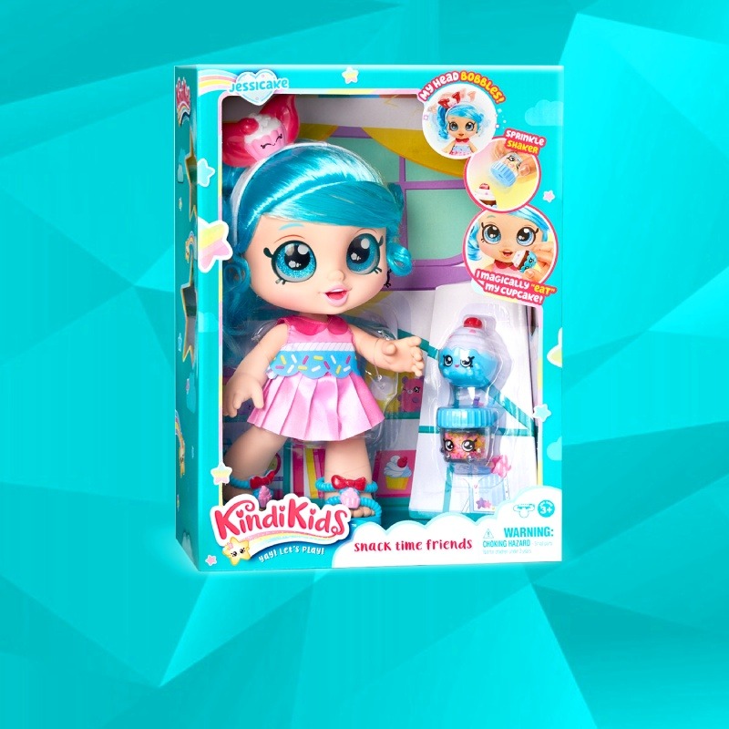
Branding and Package Design
For over 35 years, we have been passionately committed to growing the biggest brands in youth entertainment for the largest companies in the world.
TRUSTED BY:



BRANDING | PACKAGING | CREATIVE STRATEGY
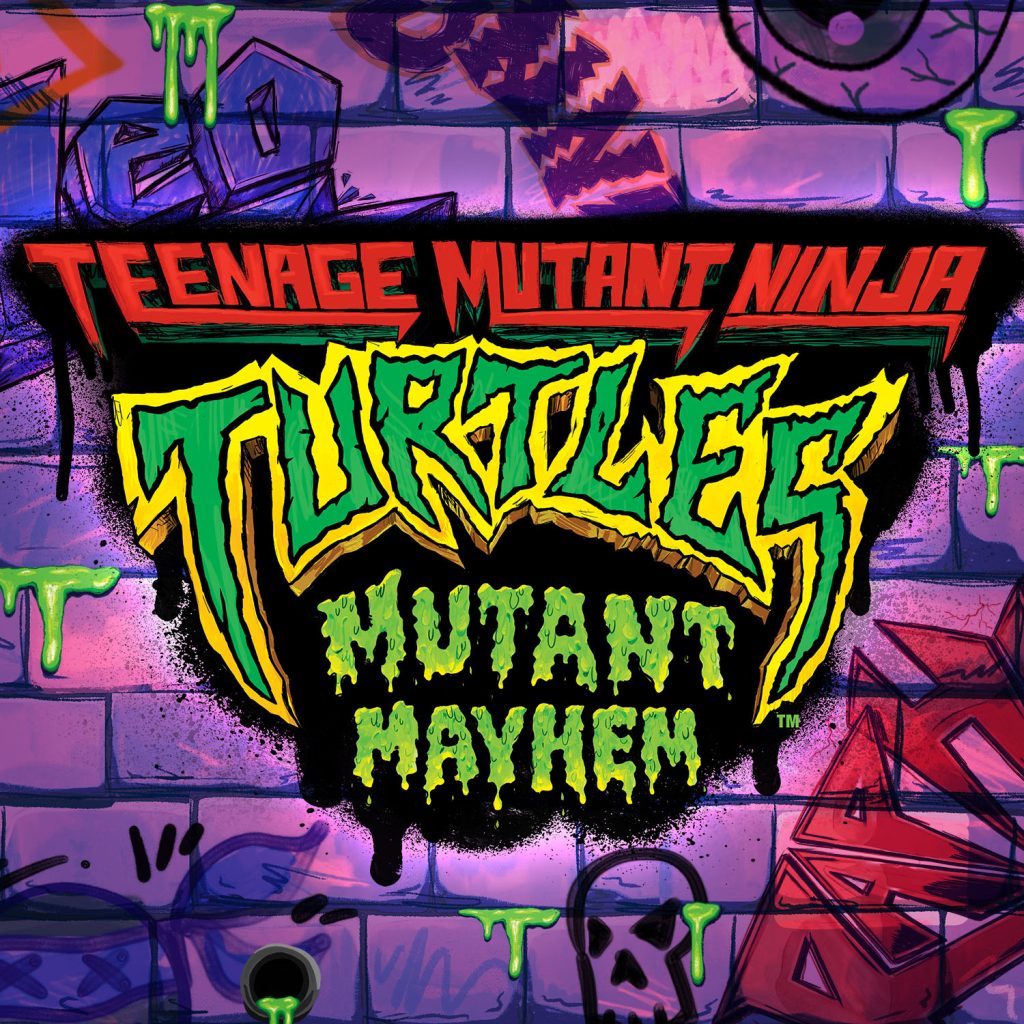
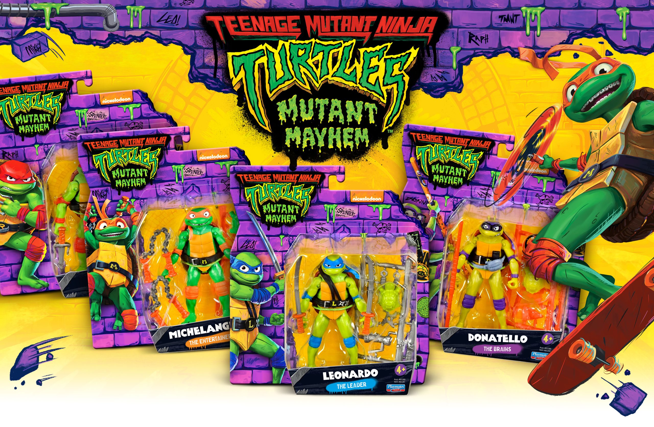
SERVING MUTANT MAYHEM SINCE 2011!
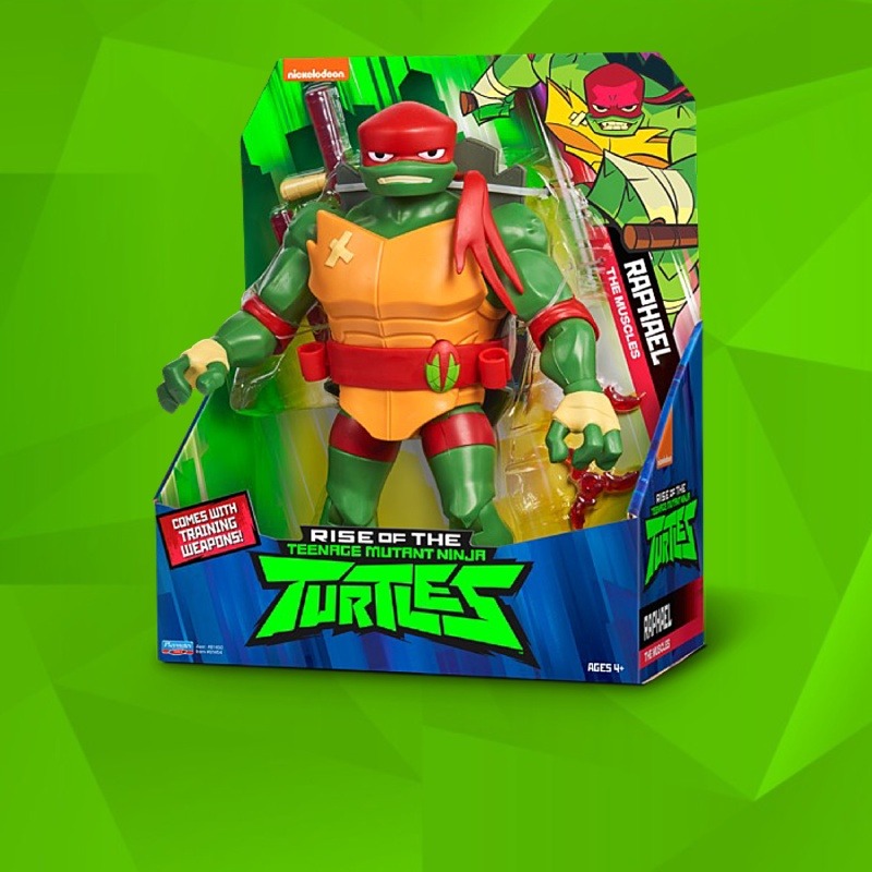
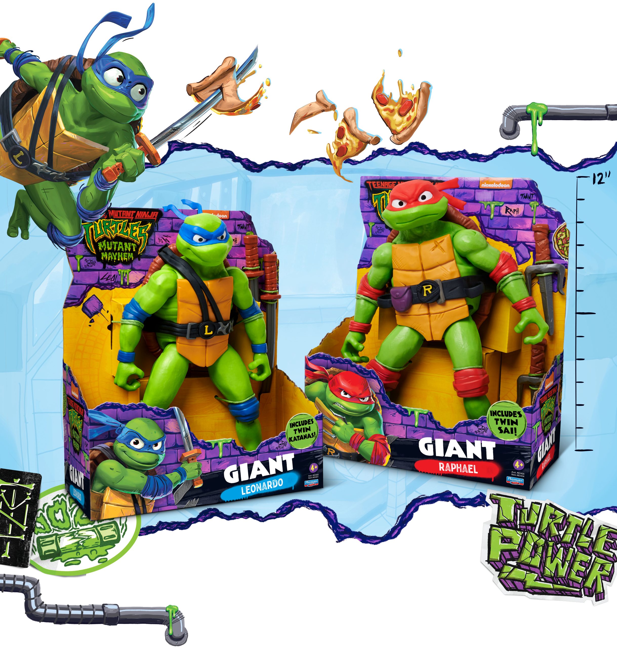
The Ninja Turtles are back in a brick breaking, sewer oozing, total “Mutant Mayhem” theatrical reboot! For over a decade, McHale Design has been producing shell-popping package design for this iconic ’80’s brand, as they propel once again to the hottest toy of the year!
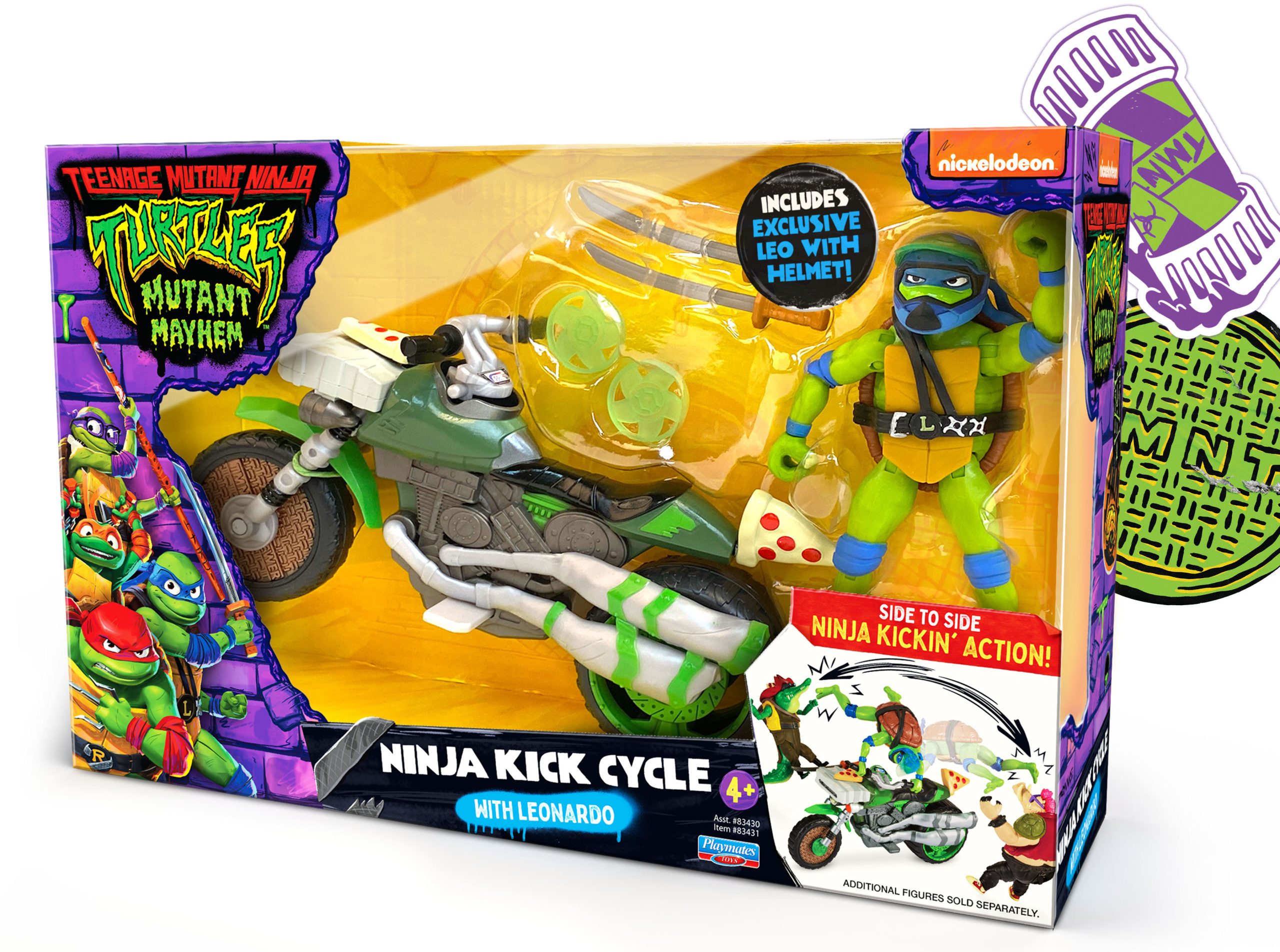
TIRE SCREECHING ACTION
Enhanced hero photos along with customized graffiti-style callouts ensure these feature-rich vehicles pop off the shelves.
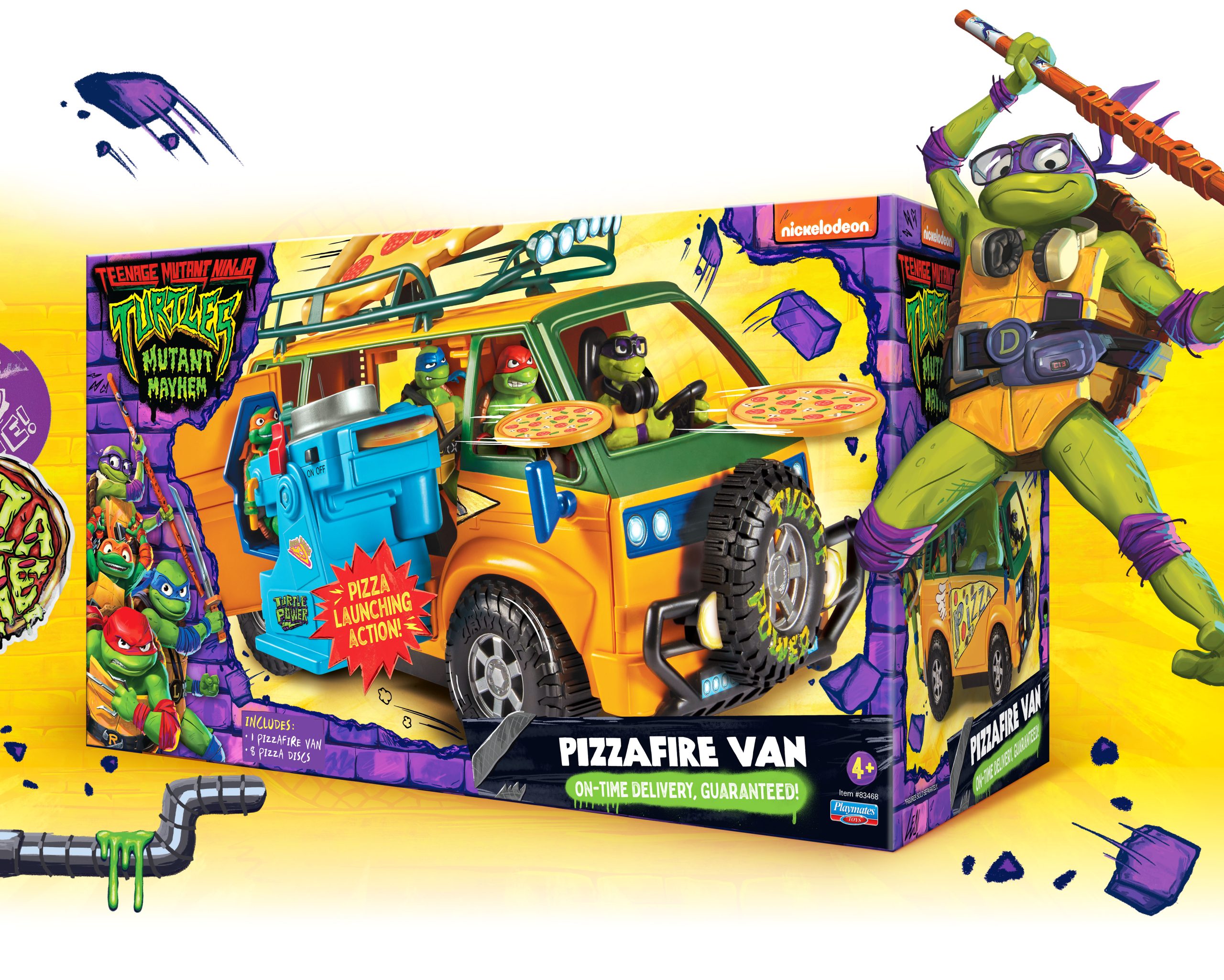
AN AMAZON EXCLUSIVE*
For an extraordinary Amazon exclusive, this “Be A Ninja” shoebox concept is inspired by retro 80’s sneakerhead culture. A slide-on O-sleeve creates high-end collectability while also serving as a functional toy storage box. We were delighted and honored to win a GDUSA Graphic Design award.
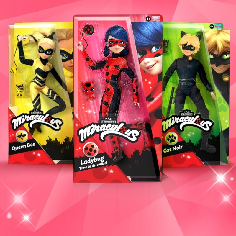
Tales of Ladybug & Cat Noir
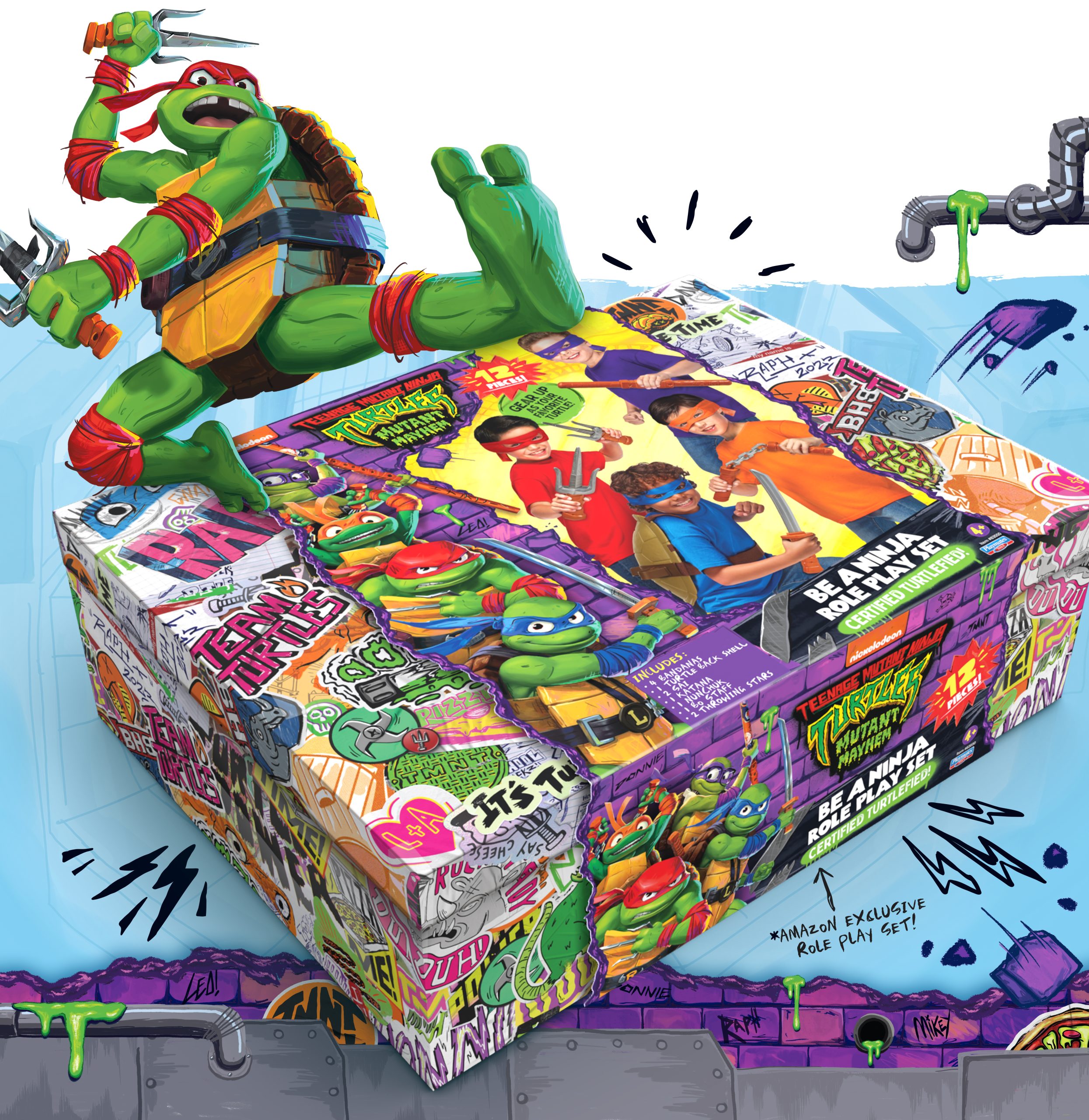
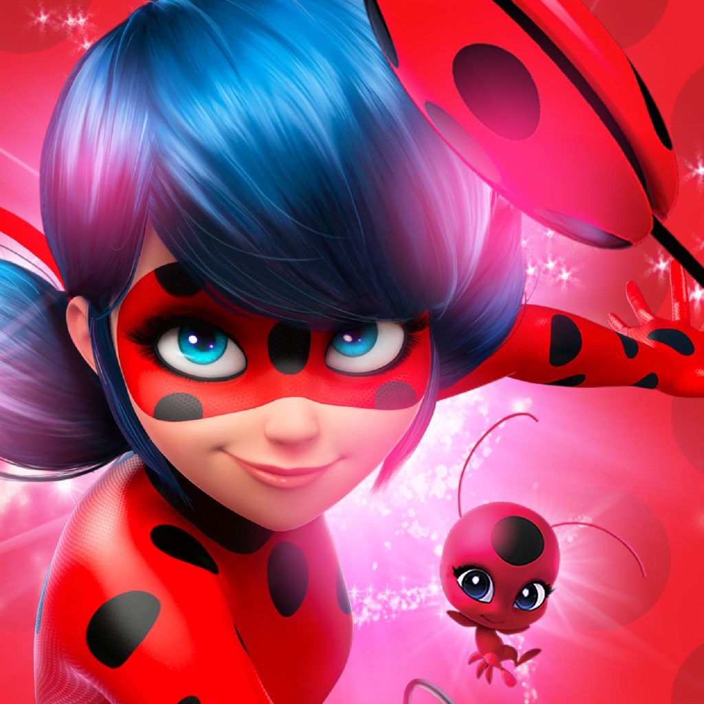
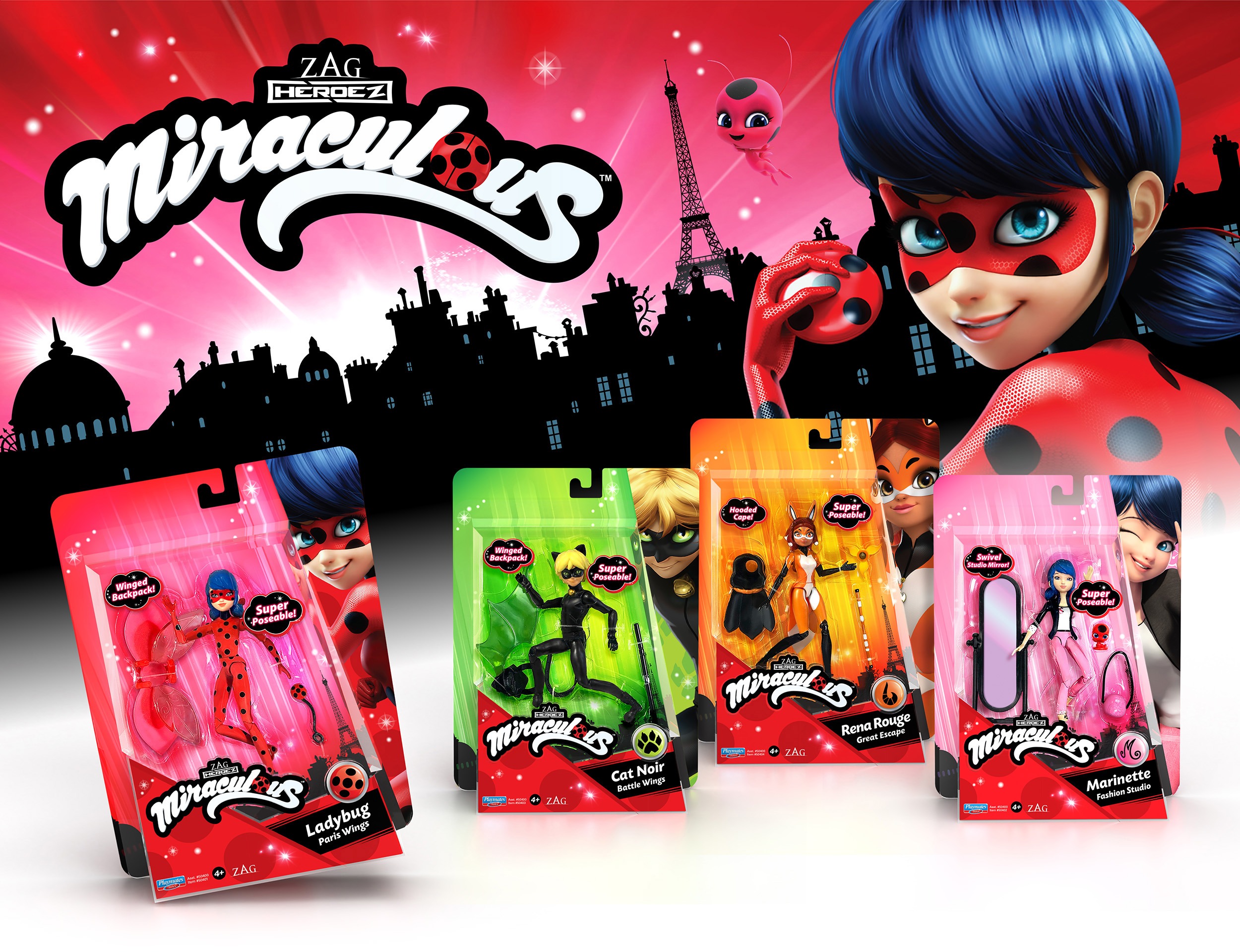
Introduced in France and South Korea, ZAG Heroez property Miraculous quickly grew an international fan-base via Nickelodeon, Netflix, the Disney Channel and Youtube. Needing a brand and packaging refresh to capitalize on the animated series’ surging popularity, Playmates Toys approached McHale Design to help develop a cohesive packaging identity celebrating the shows vibrant visual style.
The results? A GDUSA American Package Design Award!
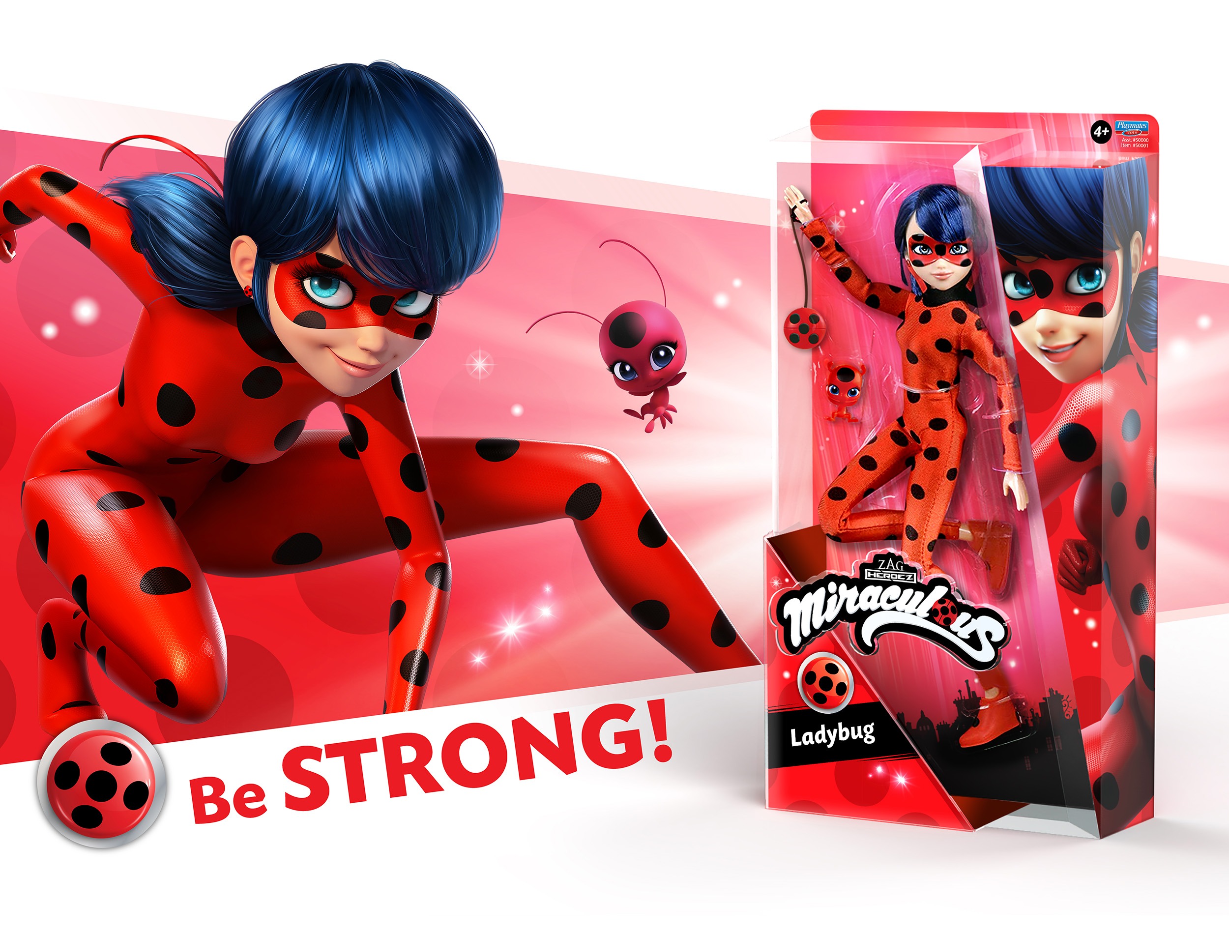
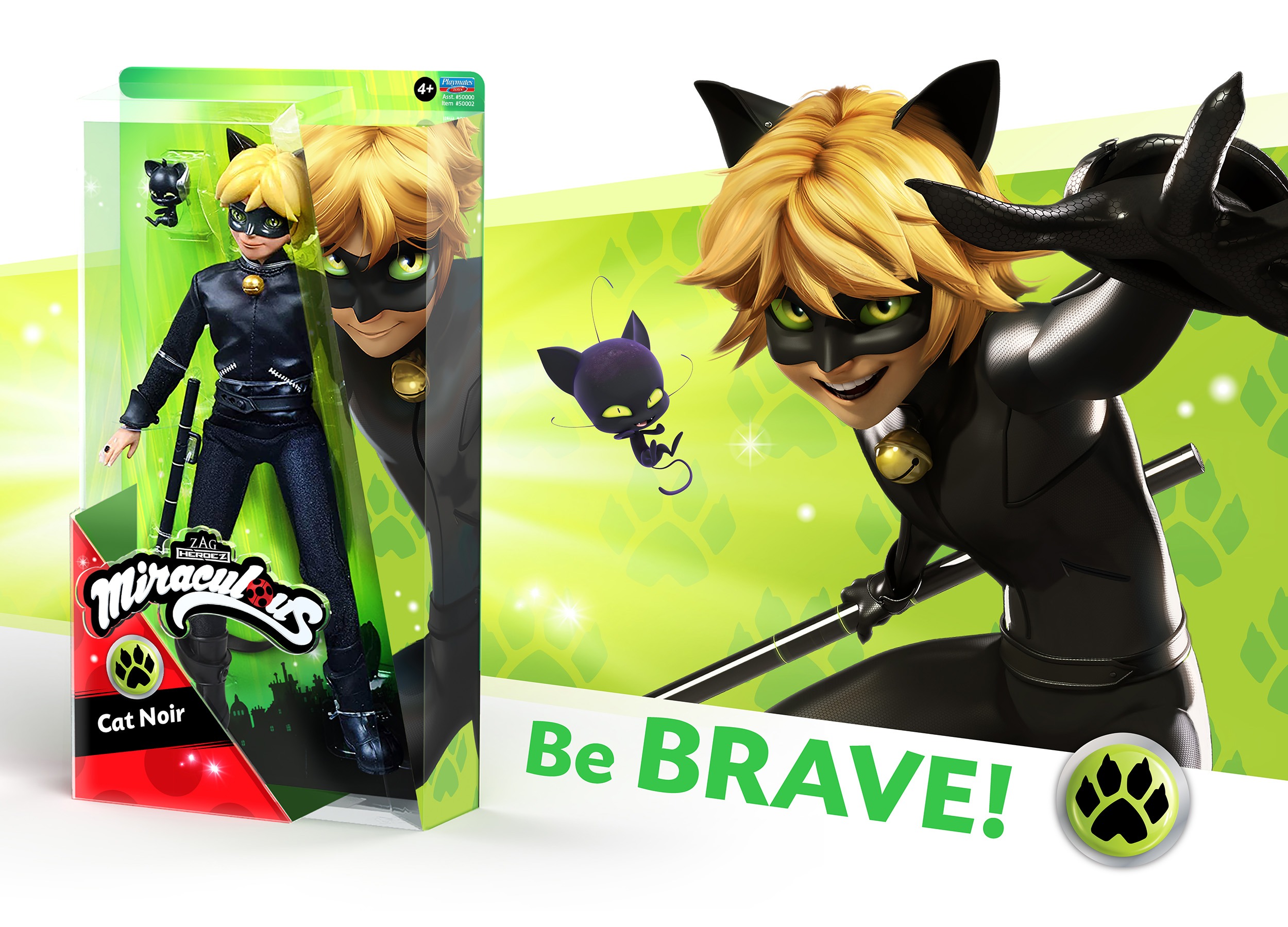
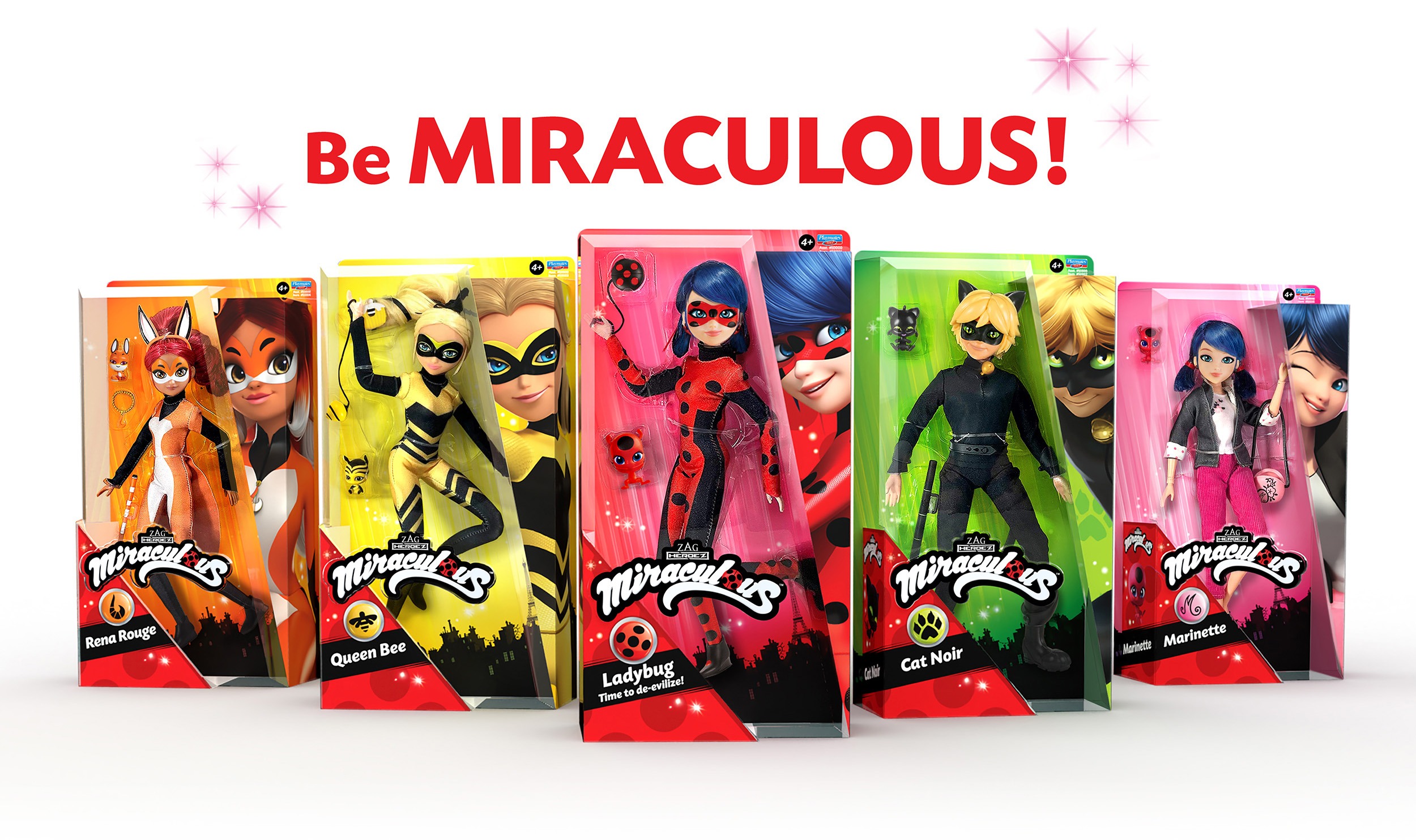
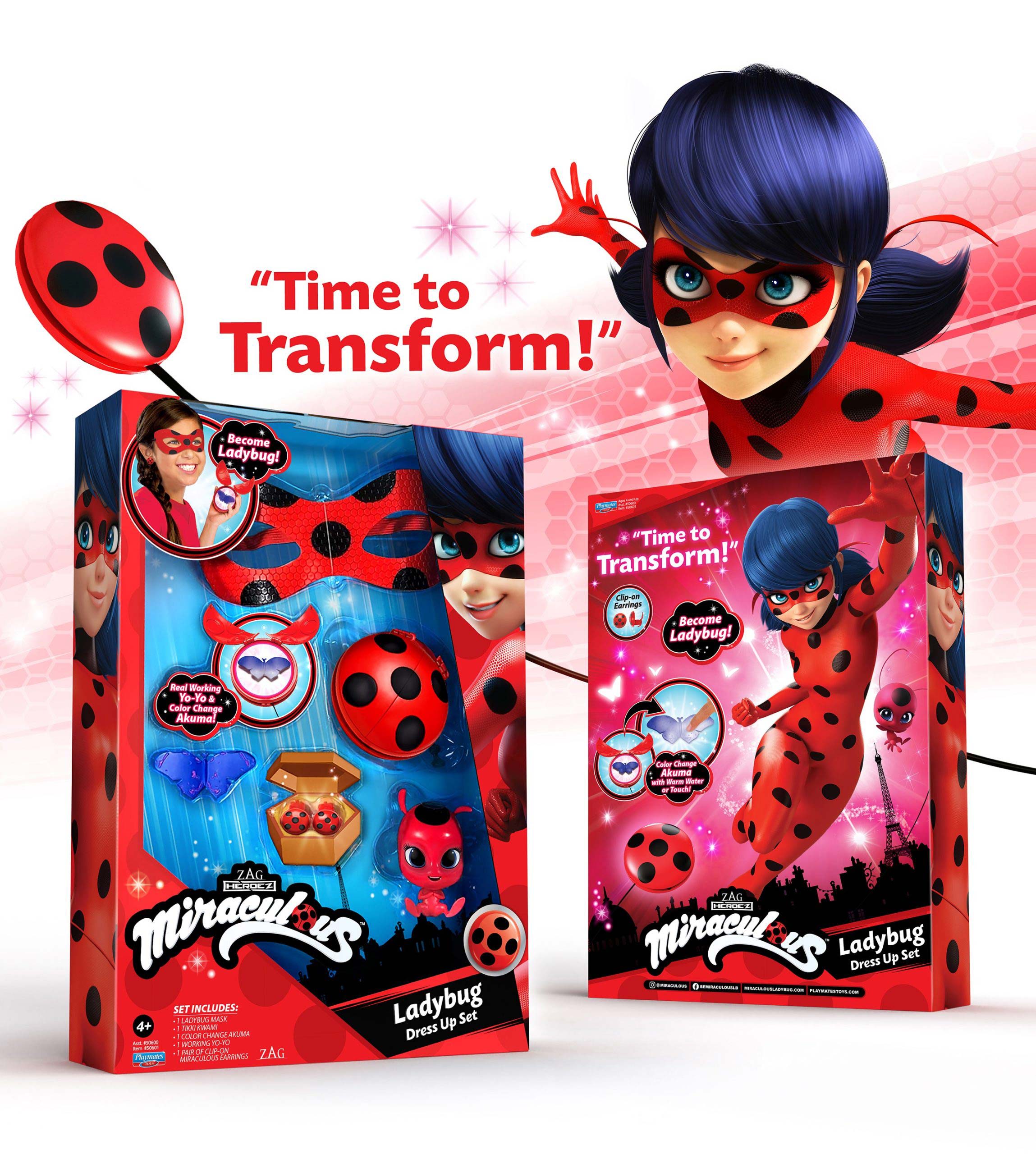
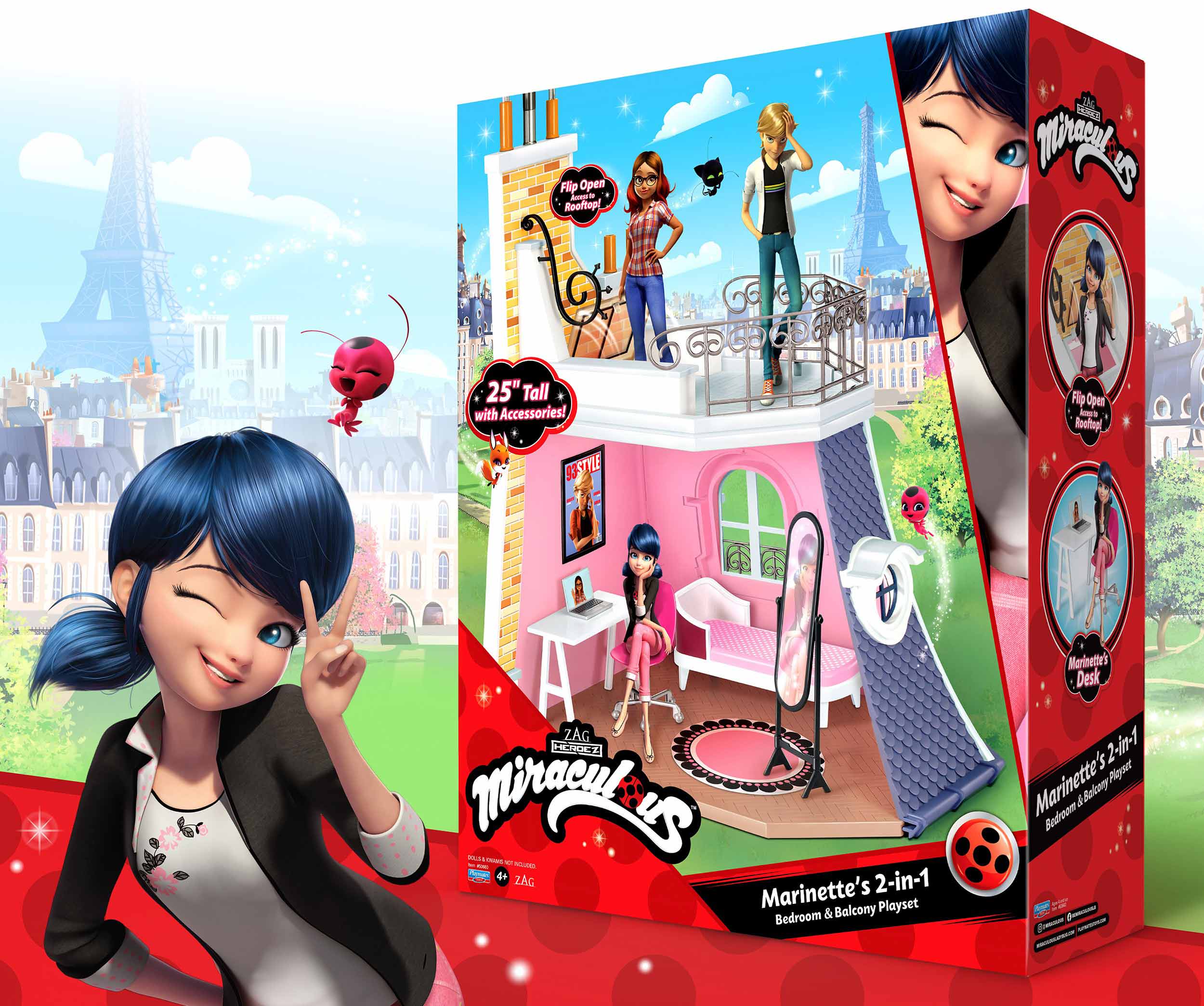
Working closely with Playmates Toys, we produced packaging design highlighting the personality of each character while reinforcing a unified visual front. We leveraged a deep catalog of resources to create bold, bright and engaging graphics that enhanced dynamic product pack-out.
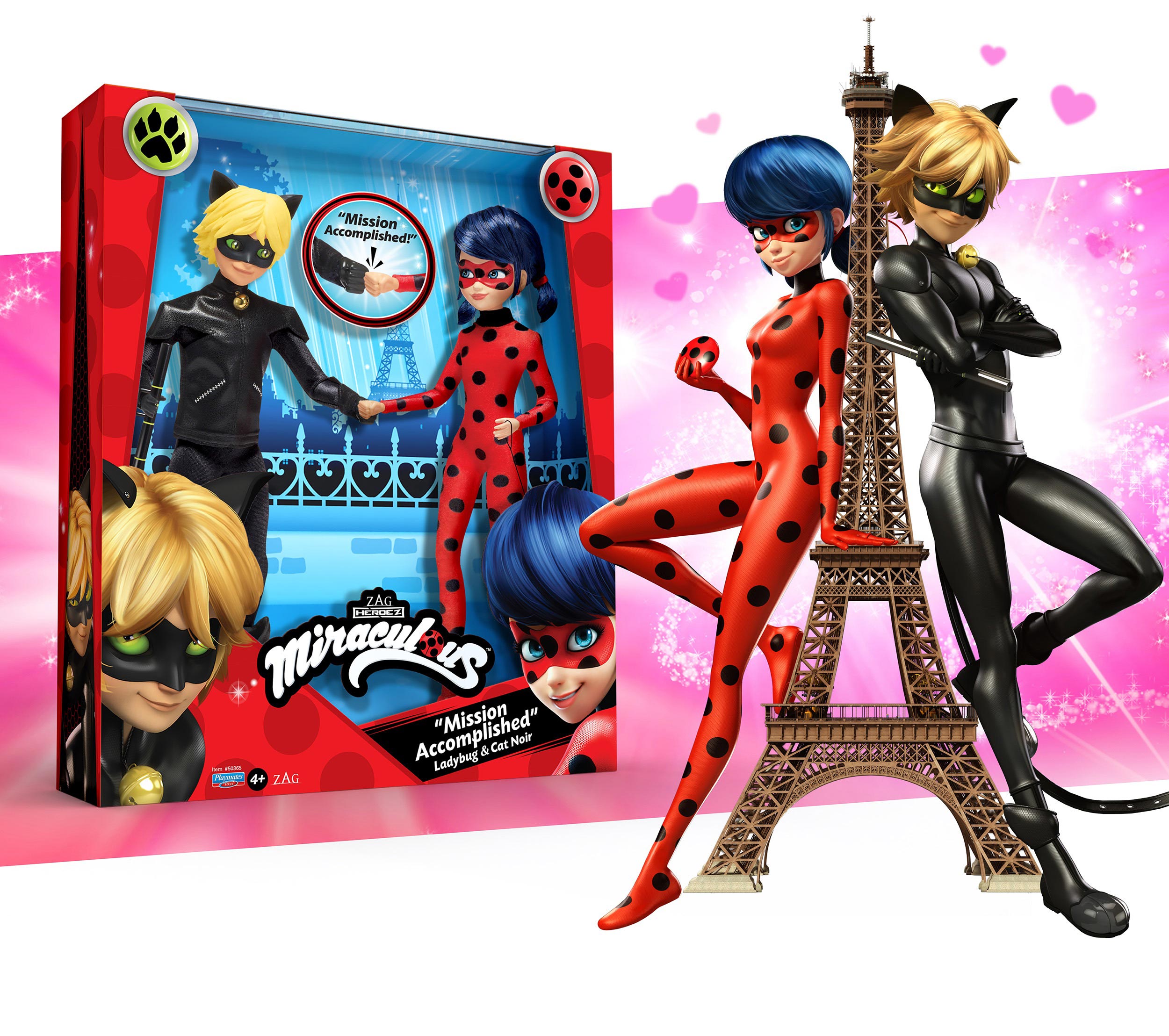
The packaging design came together with carefully blended luminous effects, patterns and textures. Inspired by the magical vivacity of the shows animation, the branding evokes the spunk of teen spirit while reaffirming positive themes of courage and friendship. Utilizing a wealth of enthusiastic character illustrations, the packaging successfully showcases the product with youthful boundless energy.
Stronger Together
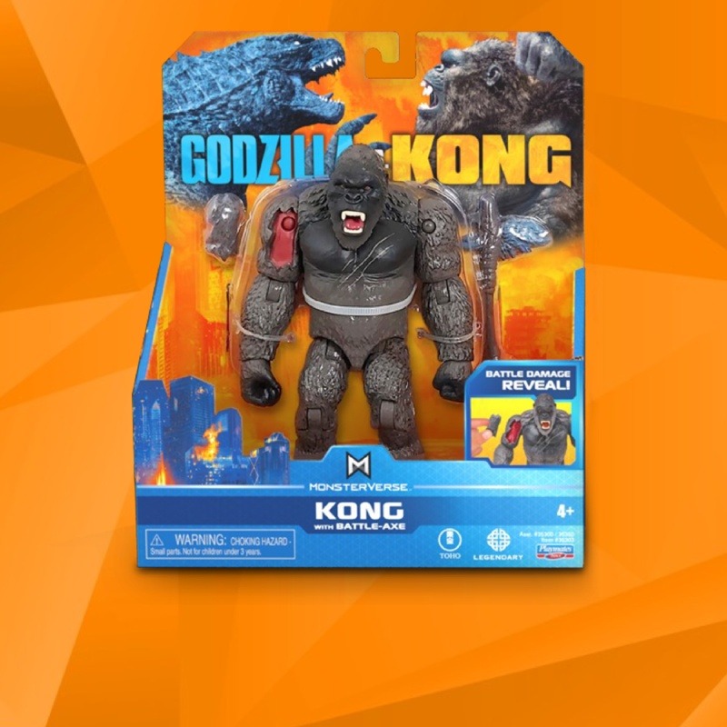
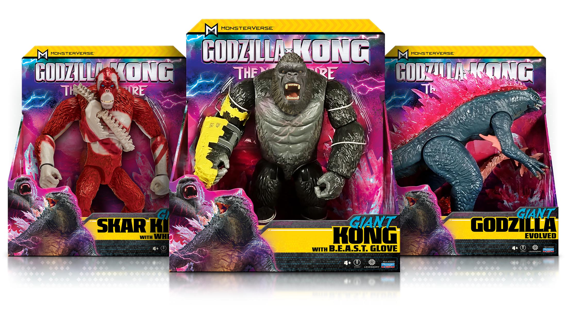
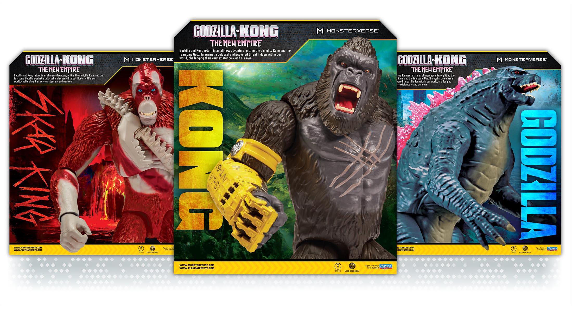
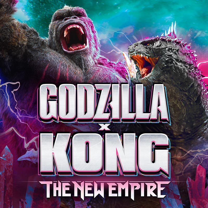
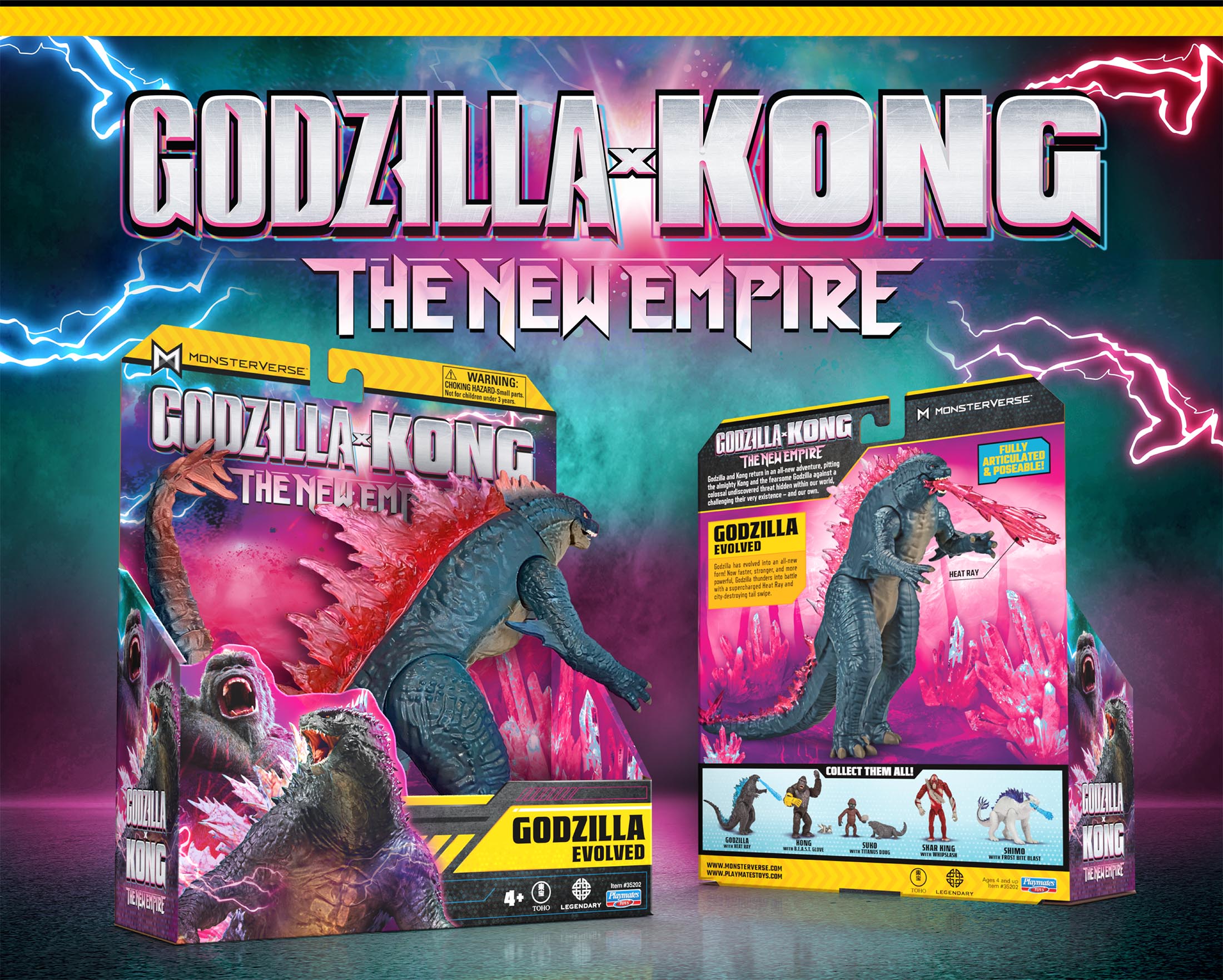
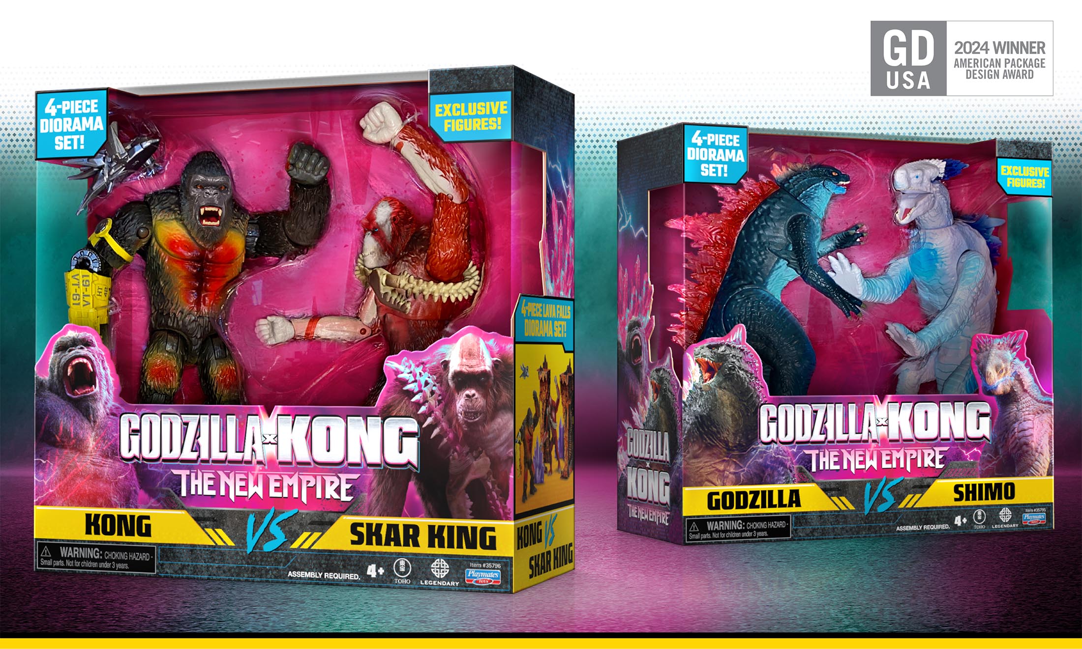
When a mysterious new threat unites the iconic titans Godzilla and Kong, Playmates Toys knew it was time to join forces once again with McHale Design to create fresh branding and packaging for “Godzilla x Kong: The New Empire.”
Our approach to branding goes beyond aesthetics; it’s about crafting an immersive experience. With meticulous attention to detail, we developed and applied an energizing color palette combined with textures, patterns, and graphic elements to tell a captivating brand story setting the bar high above the competition on the store shelf.
And our efforts haven’t gone unnoticed. Our package design for “Godzilla x Kong: The New Empire” earned us the prestigious 2024 GDUSA American Package Design award and propelled it to become a top-selling
action figure in the U.S.
Building a Legendary Franchise
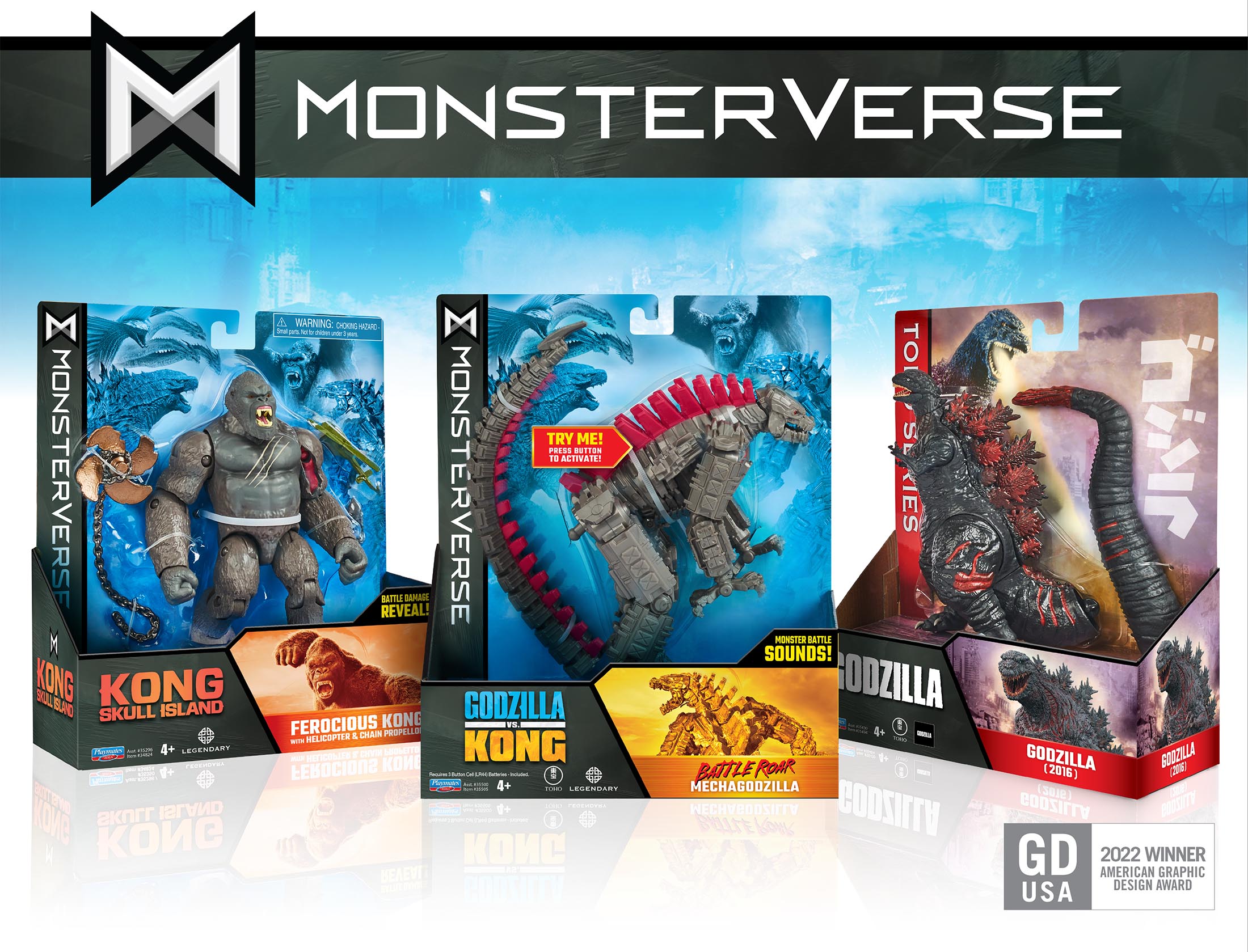
In 2021, when Godzilla and Kong clashed on the big screen, it marked the merging of two colossal franchises boasting a combined history of over 40 movies since 1933. This fusion gave birth to the epic MONSTERVERSE. McHale Design was recruited to expand the packaging and brand footprint which included Kong, Godzilla, and the original Toho Series properties.
To maintain the coherence of the Monsterverse while allowing for different segments, we implemented a distinct color scheme for each property. We crafted unique textures, patterns, and backgrounds tailored for each brand to enrich the experience for die-hard fans. This meticulous approach resulted in a compelling shelf presence and earned the 2022 GDUSA American Graphic Design Award.
Get Ready for the Rumble!
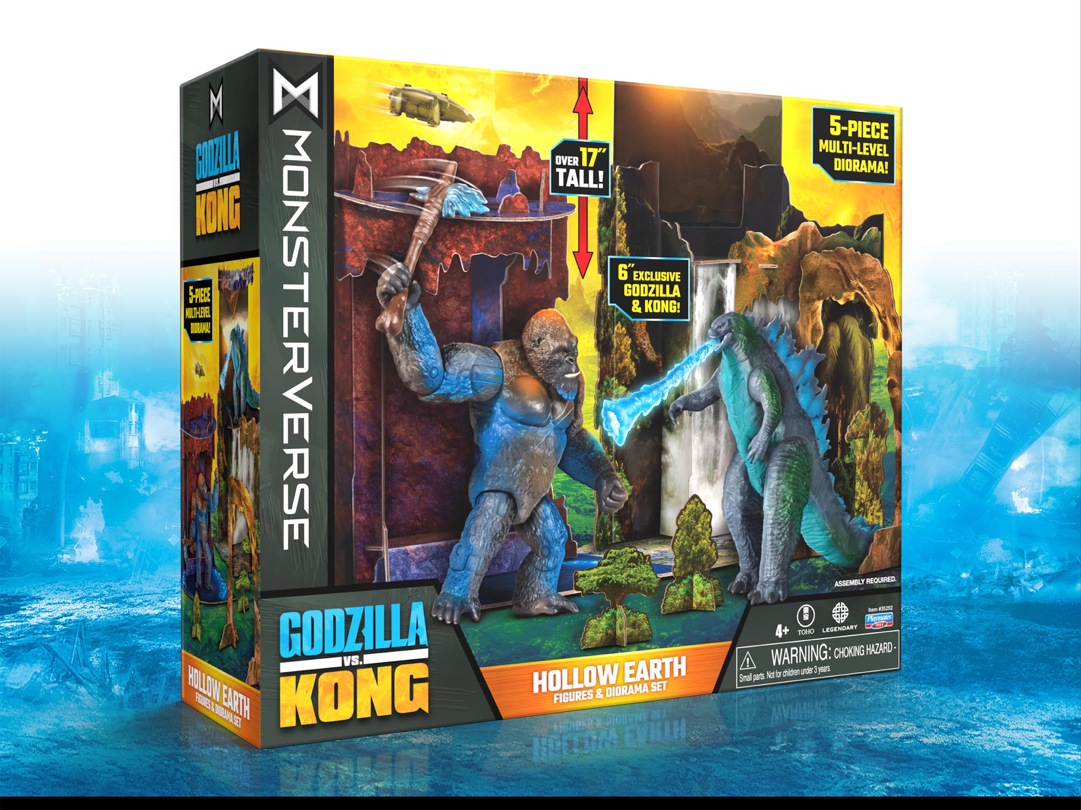
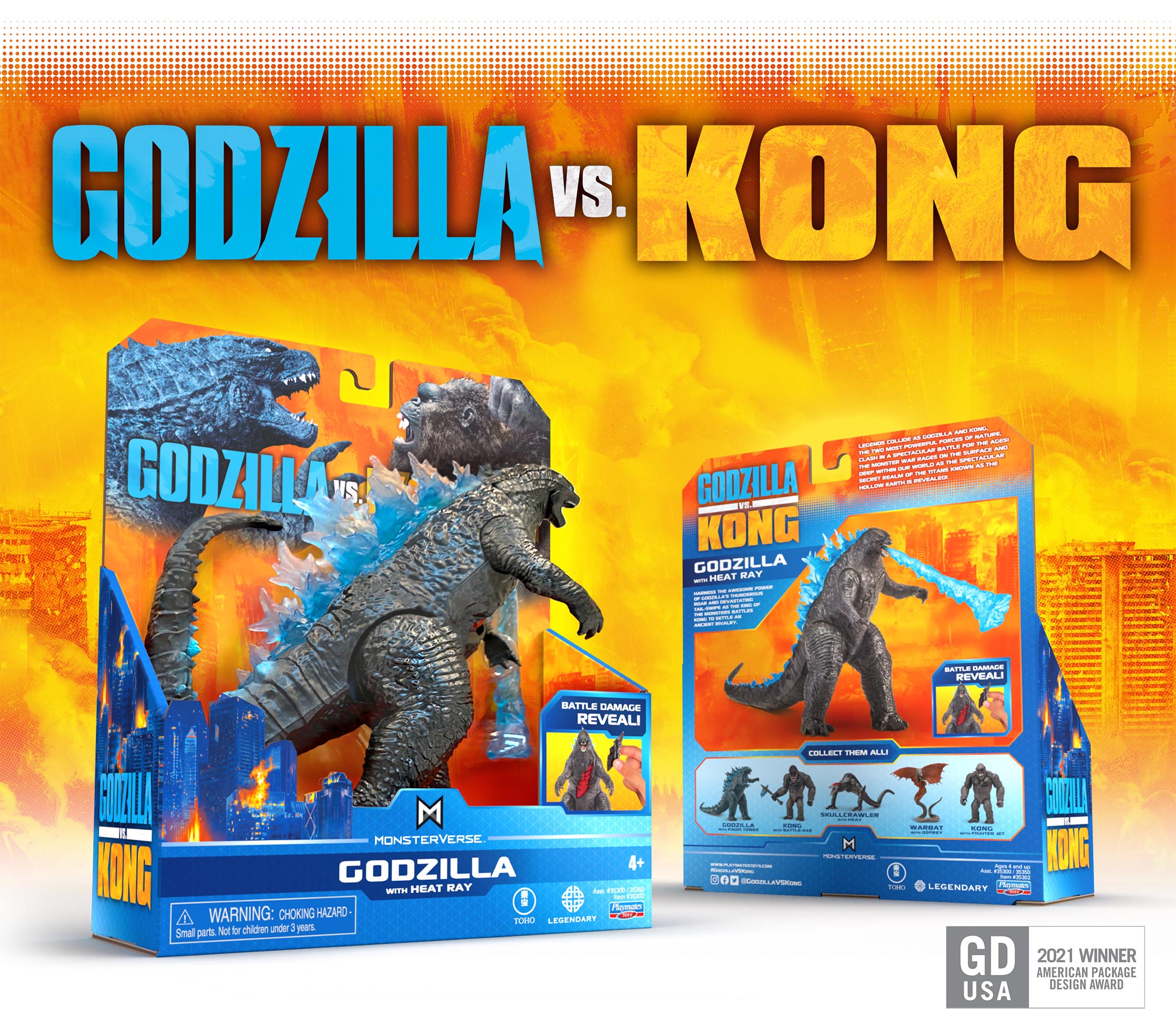
Playmates Toys challenged McHale Design to develop a packaging system emphasizing the enormous scale and
over-the-top action of Godzilla and Kong’s epic clash. We hopped into the ring and created branding and packaging worthy of the legendary pair, resulting in our 2021 GDUSA American Package Design Award.
Concept Sketches: Prepare for Fight Night
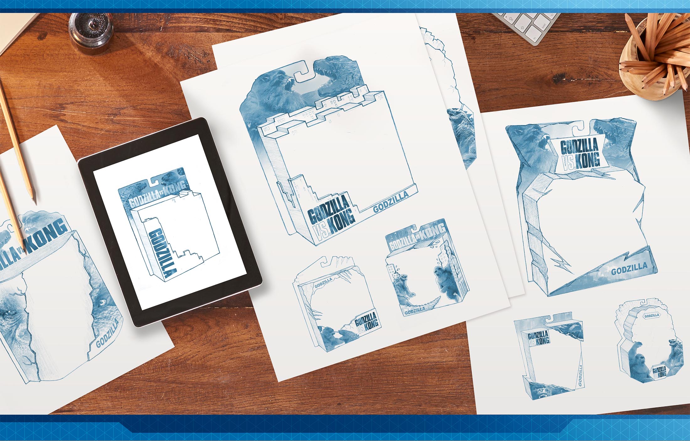
Working with limited assets in the earliest conceptual stages, we sketched a wide range of possible package structure forms, helping to make decisions on logo and key art placement as well as establishing dynamic story-telling aspects of the packaging. Early concepting helped determine packaging structure costs.
We resolved to push the two behemoths to the top of the package, emphasizing their massive size, with the contenders facing off and towering over the devastated city below. We adapted movie key art and elements for compelling shelf impact, reinforcing the key story elements of face-to-face combat and collateral destruction
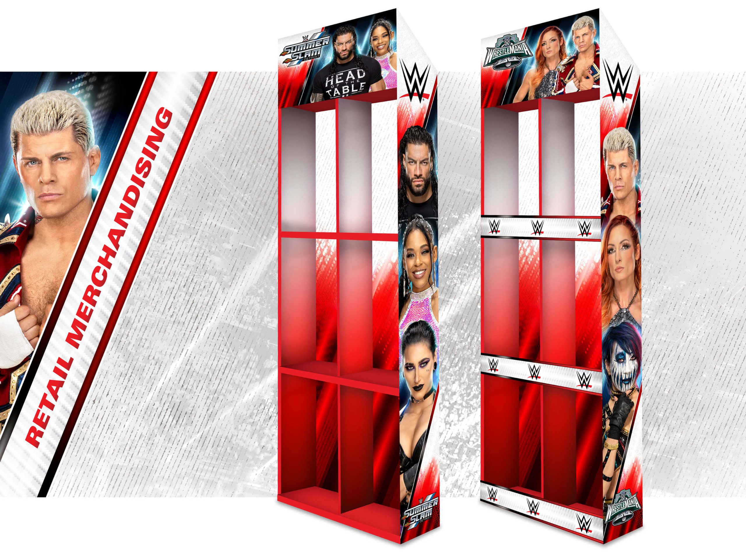
OOOH YEAH! NEW WWE BRANDING STYLE GUIDE FLYING IN FROM THE TOP ROPE!
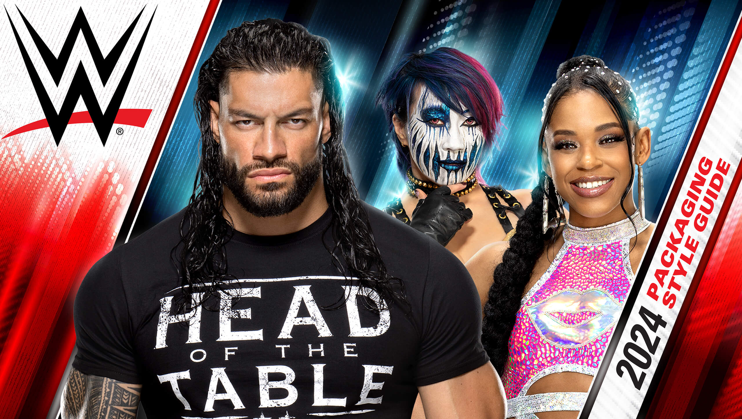
When Mattel tagged us in to develop new Branding and Package Design and a Style Guide for WWE’s 2024 core line, we knew we had to bring the no-holds-barred thunder. Our challenge? To deliver the raw energy of WWE right into the hands of both young enthusiasts and seasoned collectors.
Picture this: spotlights blazing, adrenaline pumping, and the crowd roaring. With the WWE Packaging Style Guide, we crafted an experience—a powerbomb of visual storytelling. In the WWE, Superstars reign supreme, so we made sure their faces and names take center stage and every Superstar leaps off the shelves with jaw-dropping visuals.
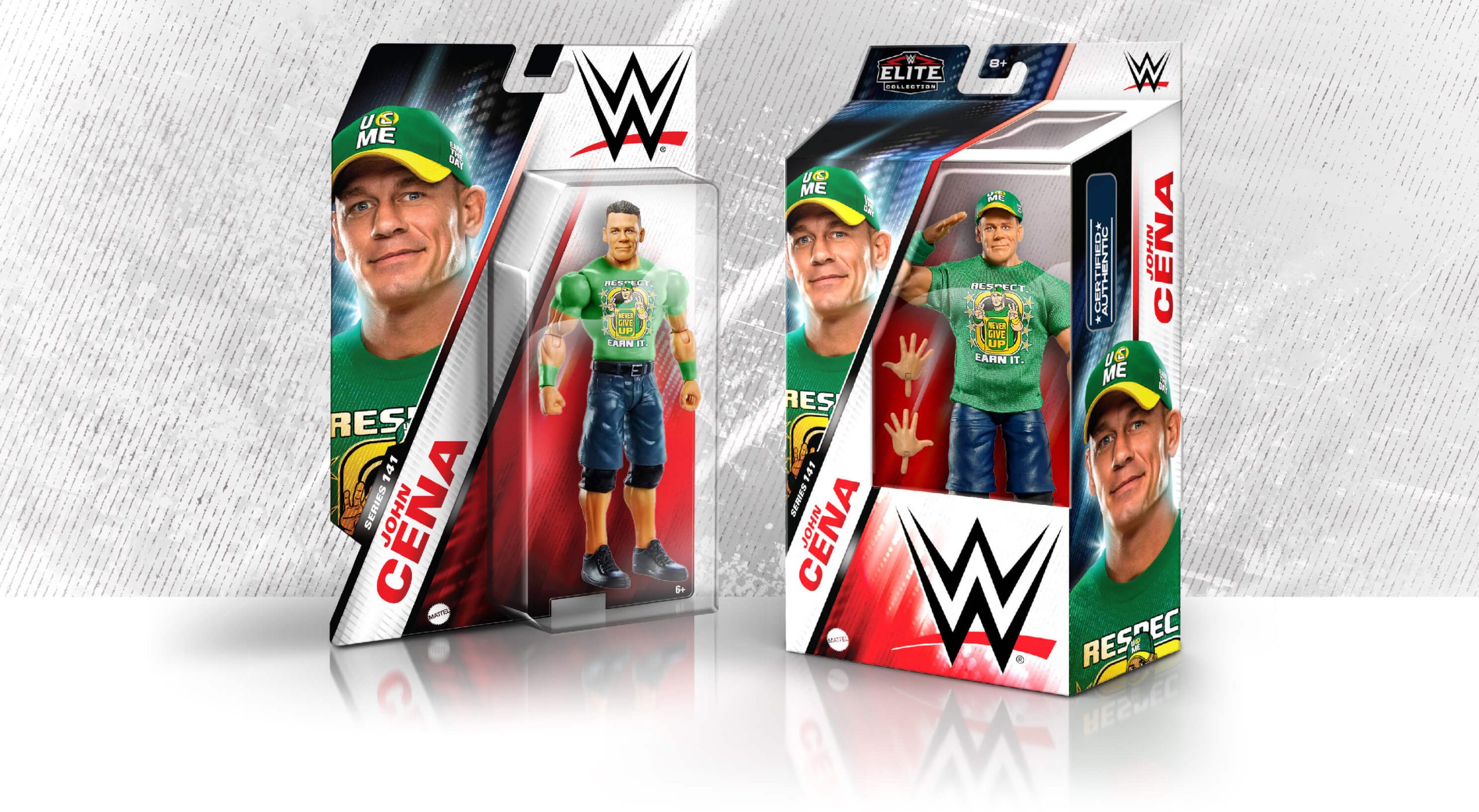

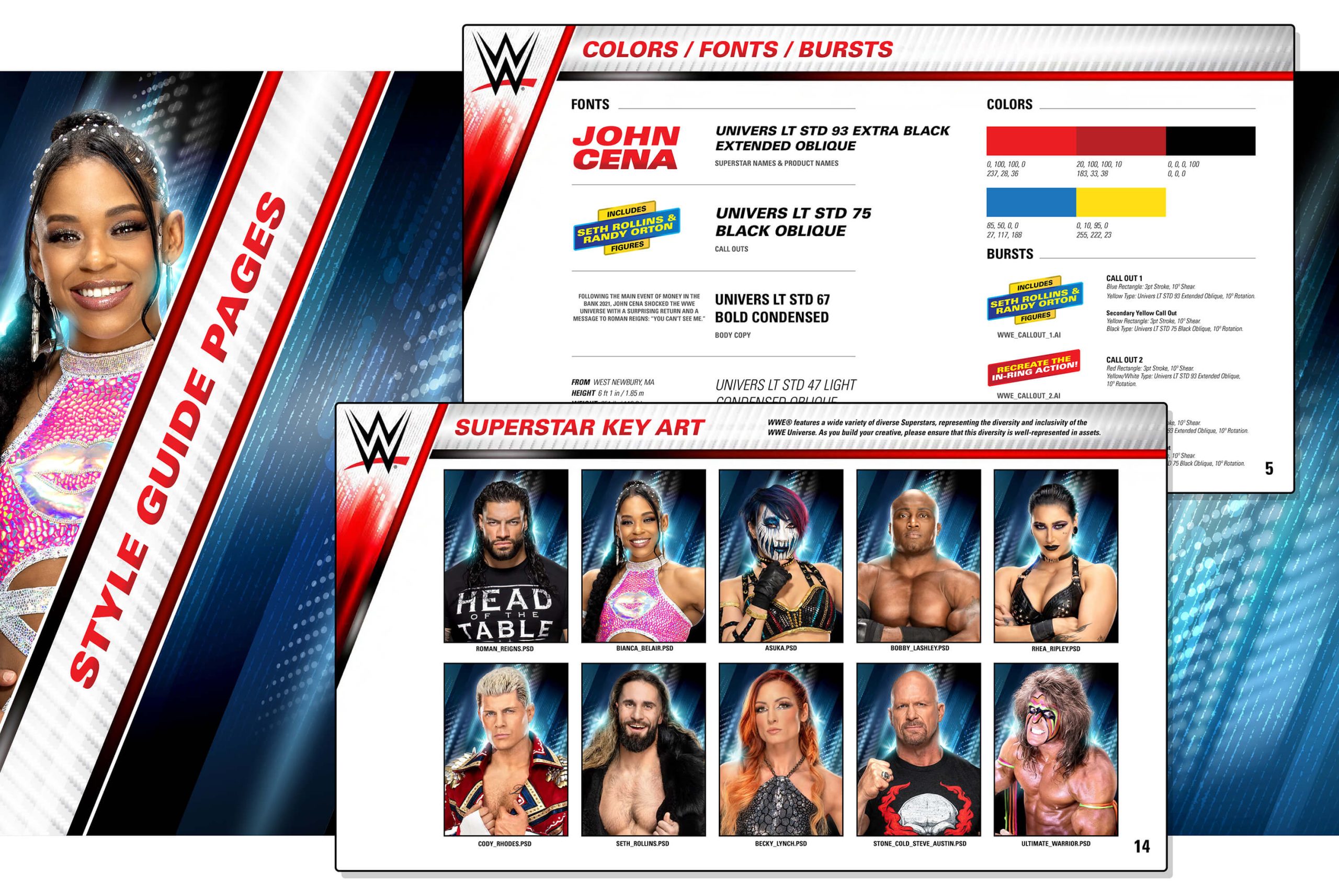
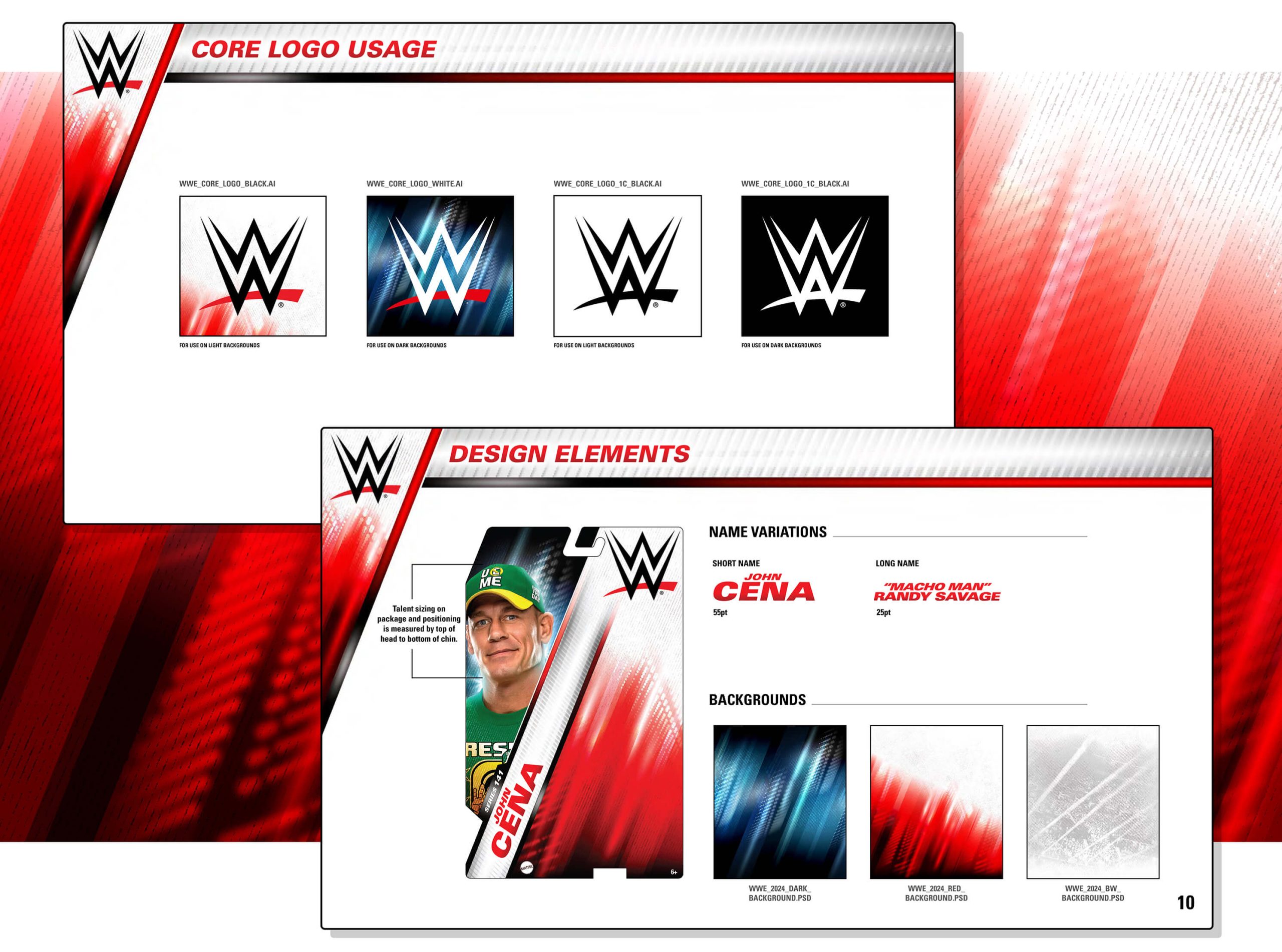
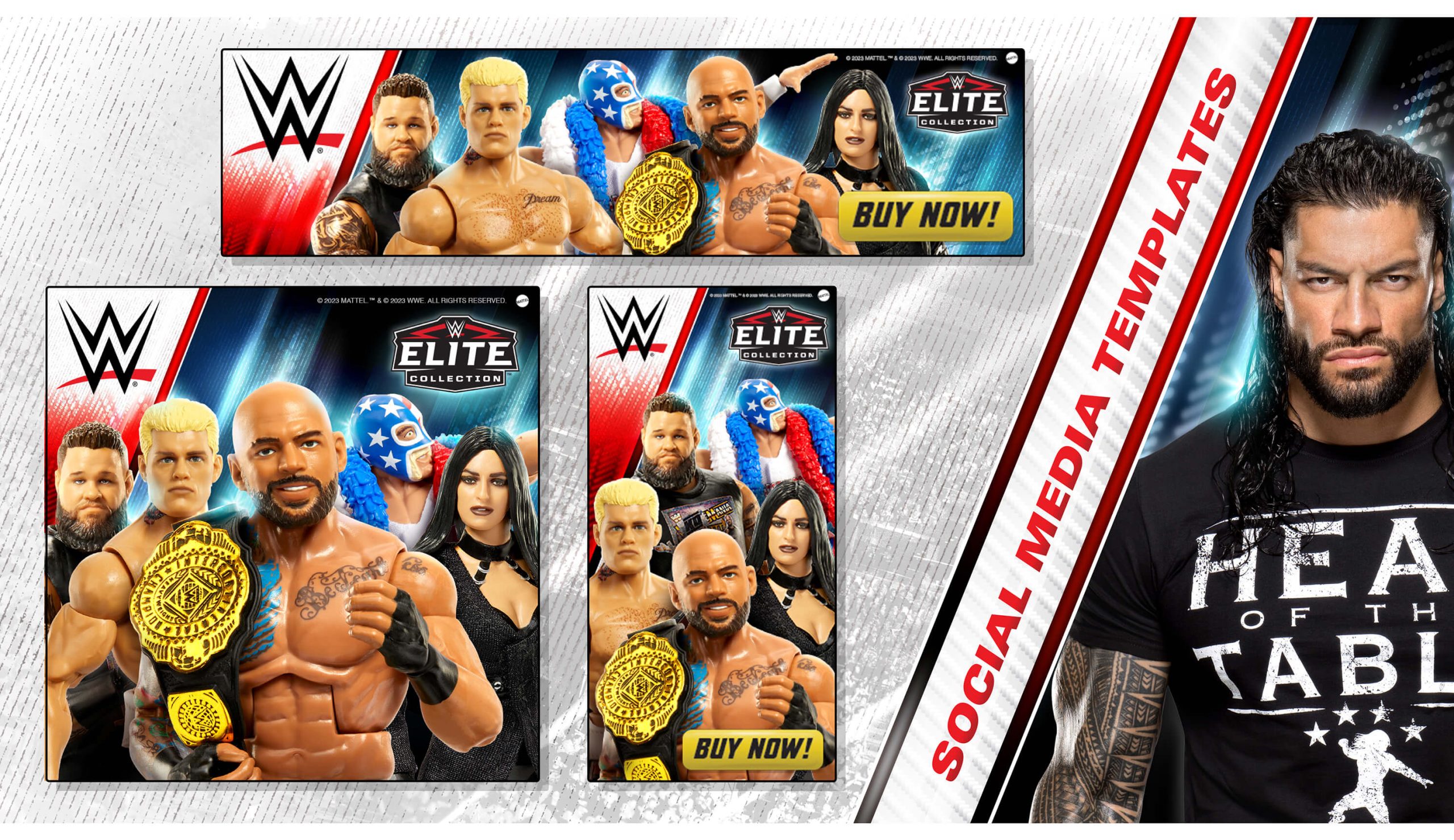
Our powerhouse team established a brand identity that’s as versatile as a WWE superstar, ensuring it would dominate across a diverse range of packaging. From the canvas of brand colors and fonts to the electrifying design elements, we left no turnbuckle unturned. And with the signature WWE Superstar key art leading the charge, Mattel’s products are ready to enter the ring of consumer consciousness and emerge victorious every time!


READY TO PLAY?
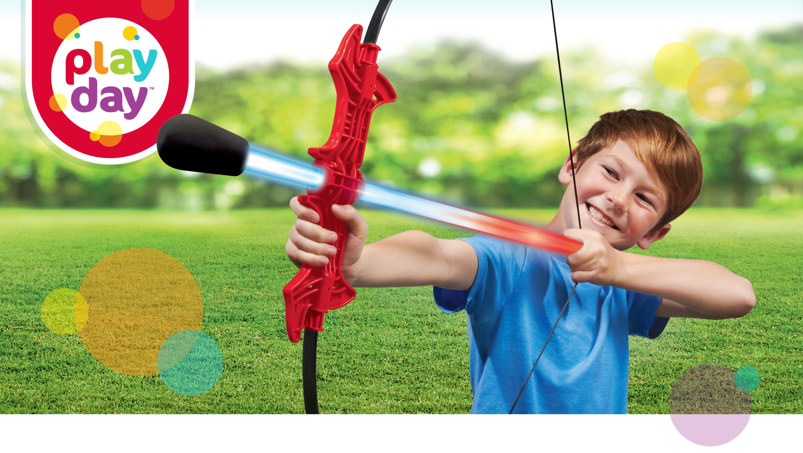
Offering a wide selection of indoor/outdoor toys, Play Day is a staple private label brand in Walmart’s toy aisle. When Walmart sought to refresh the brand, we jumped at the opportunity, instilling a contemporary, new energy that shouts “Let’s Play!” With an updated logo, color palette, typography and modular brand layout, our redesign refreshes the branding and packaging with the essence of Play Day—celebrating joyful, imaginative fun.
Beginning with a competitive market analysis, we developed mood boards that evoke the vision and essence of the brand. Color, textures, typography and photography exploration clarify the design direction.
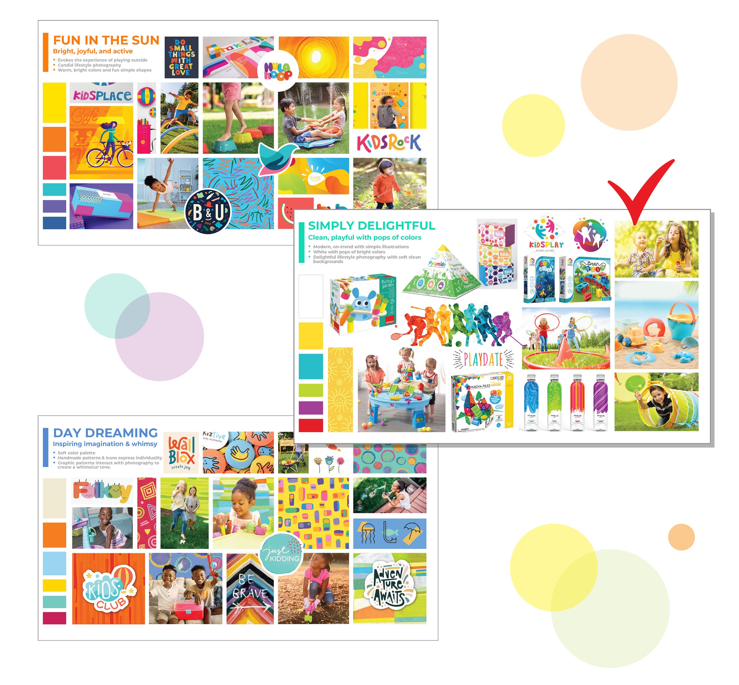
Beginning with a competitive market analysis, we developed mood boards that evoke the vision and essence of the brand. Color, textures, typography and photography exploration clarify the design direction.

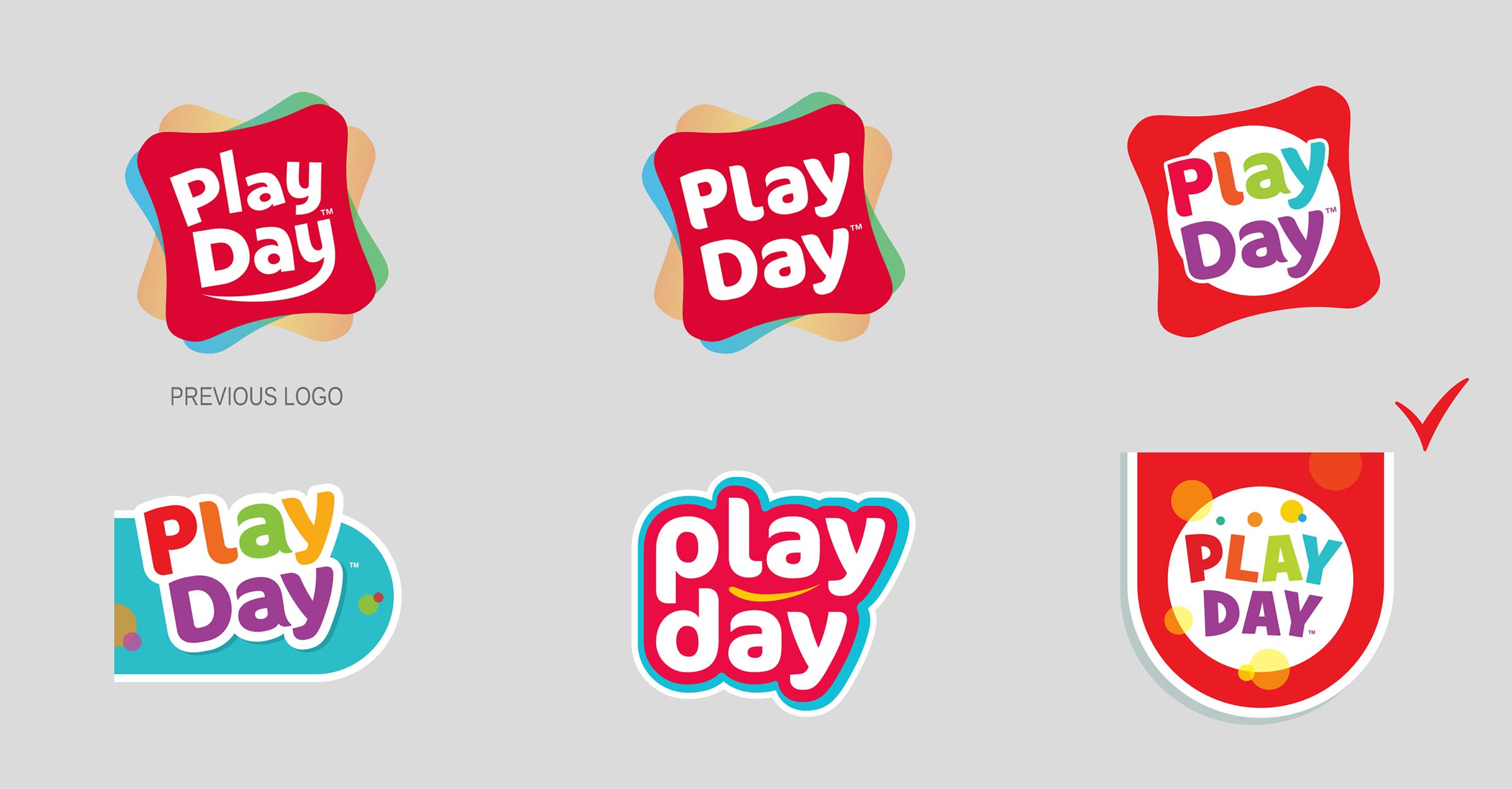
Focus group feedback informed us that the existing Play Day logo and red brand color invoked familiarity and established connections to its core consumers.
Our logo concepts range from evolutionary to revolutionary while keeping the brand values of “fun, playful, and active.”
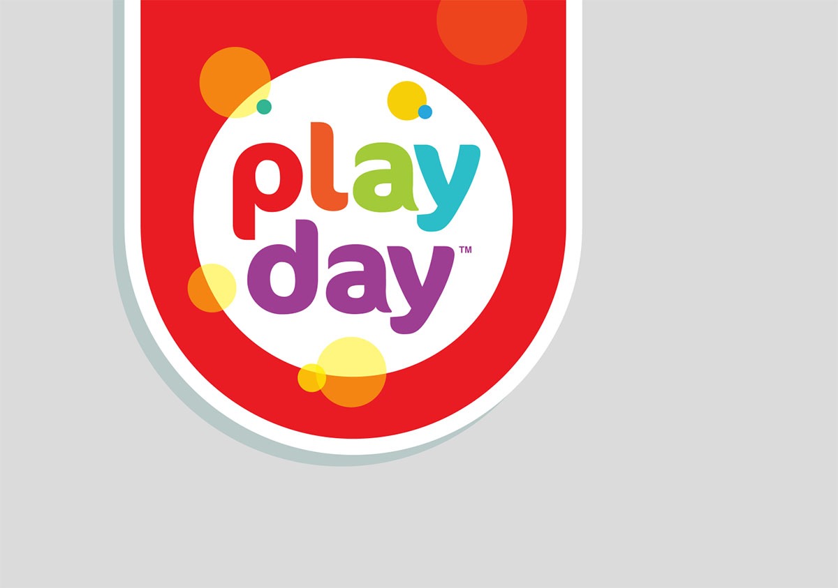
The chosen logo incorporates an updated typeface, unique holder shape, and fun circle elements while preserving the brand equity of the original logo colors.
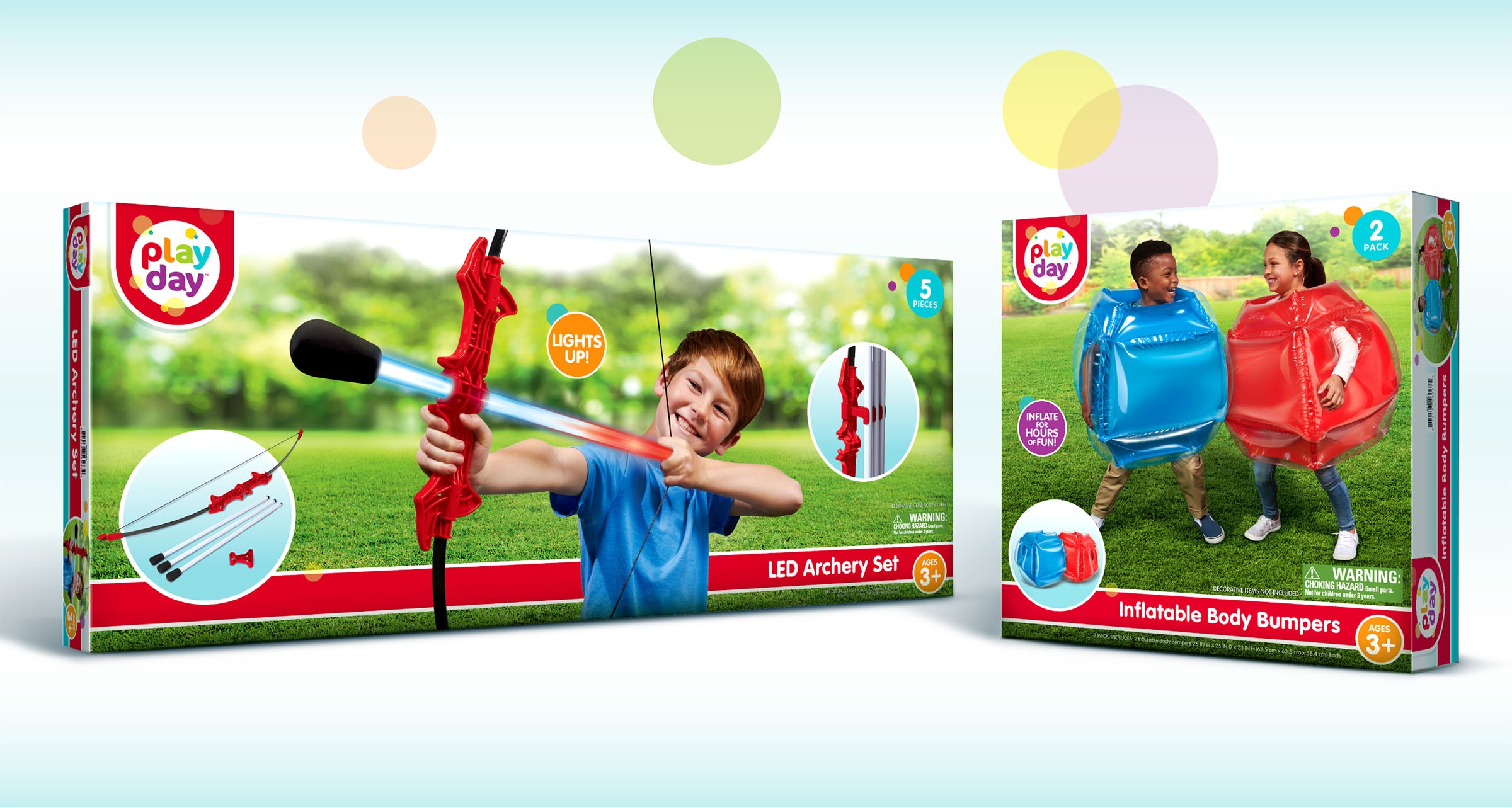
The Play Day brand covers hundreds of SKUs on shelves in over 10,000 Walmart stores worldwide. Such a wide range of packaging sizes and shapes required a modular design solution that would ensure brand consistency on package and on shelf.
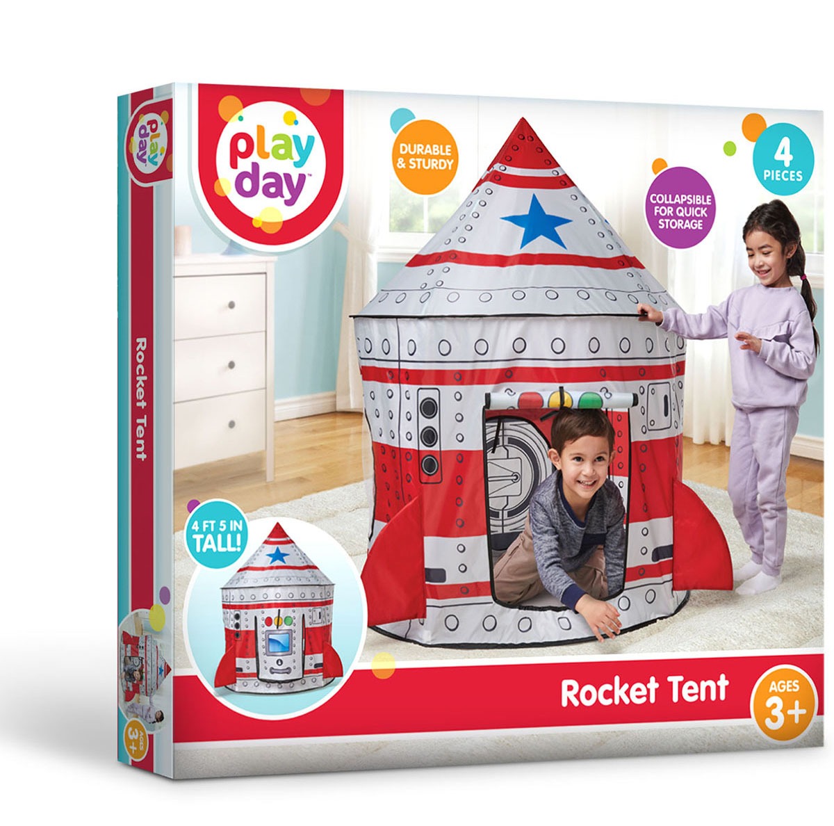

The Play Day brand covers hundreds of SKUs on shelves in over 10,000 Walmart stores worldwide. Such a wide range of packaging sizes and shapes required a modular design solution that would ensure brand consistency on package and on shelf.
The Play Day brand covers hundreds of SKUs on shelves in over 10,000 Walmart stores worldwide. Such a wide range of packaging sizes and shapes required a modular design solution that would ensure brand consistency on package and on shelf.
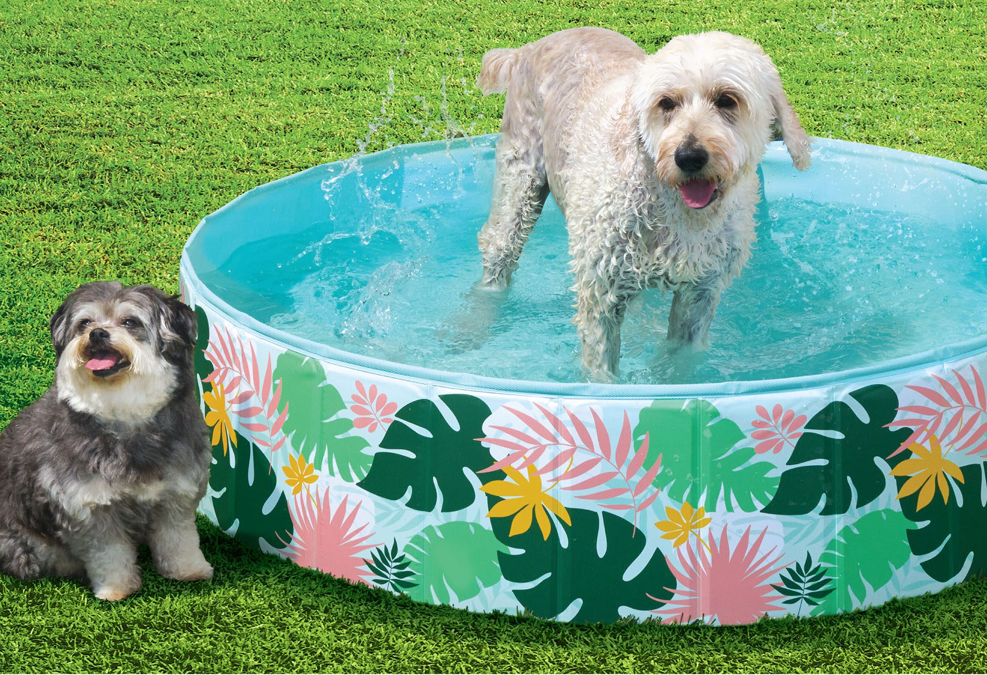
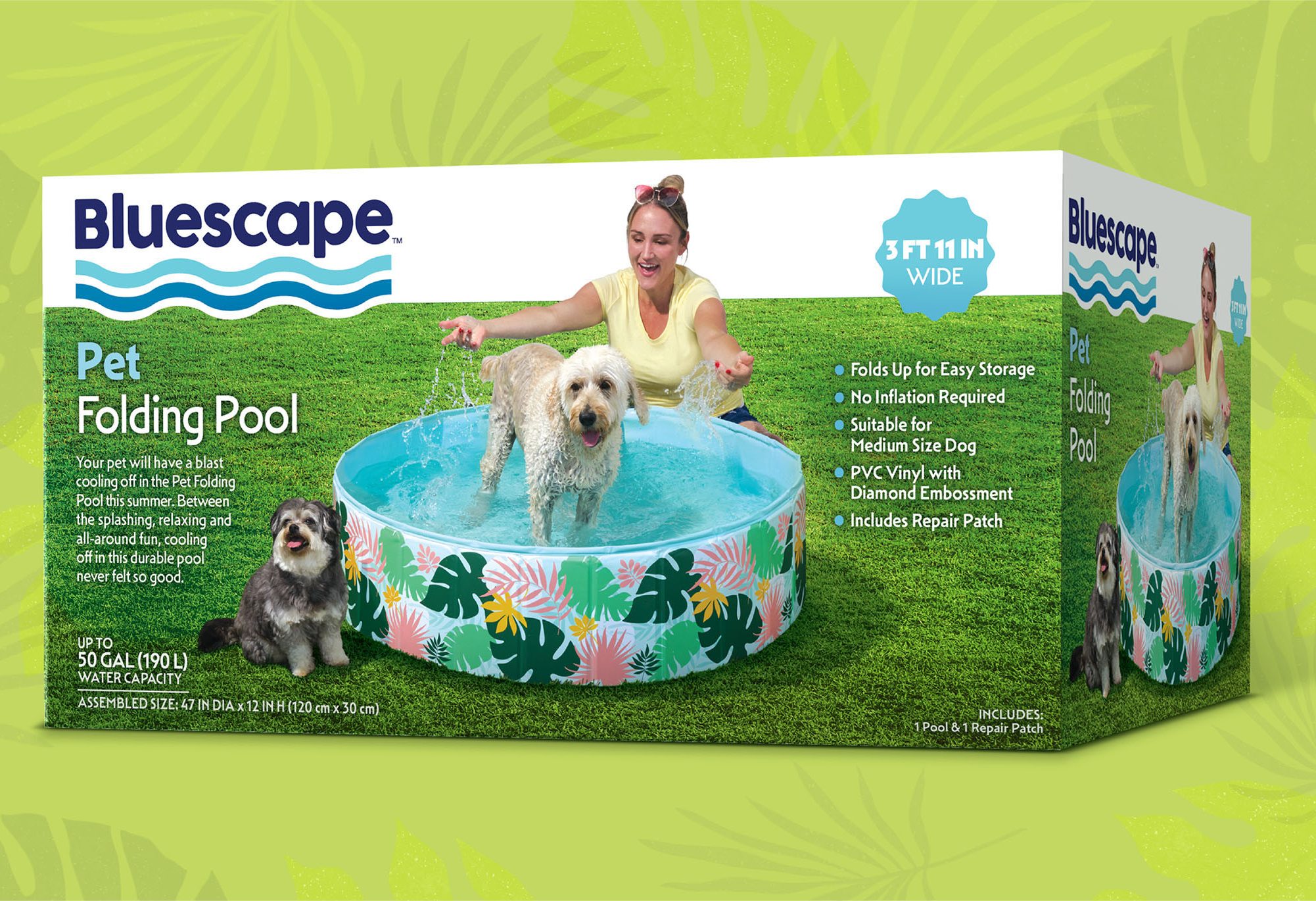
TAKING THE CREATIVE PLUNGE
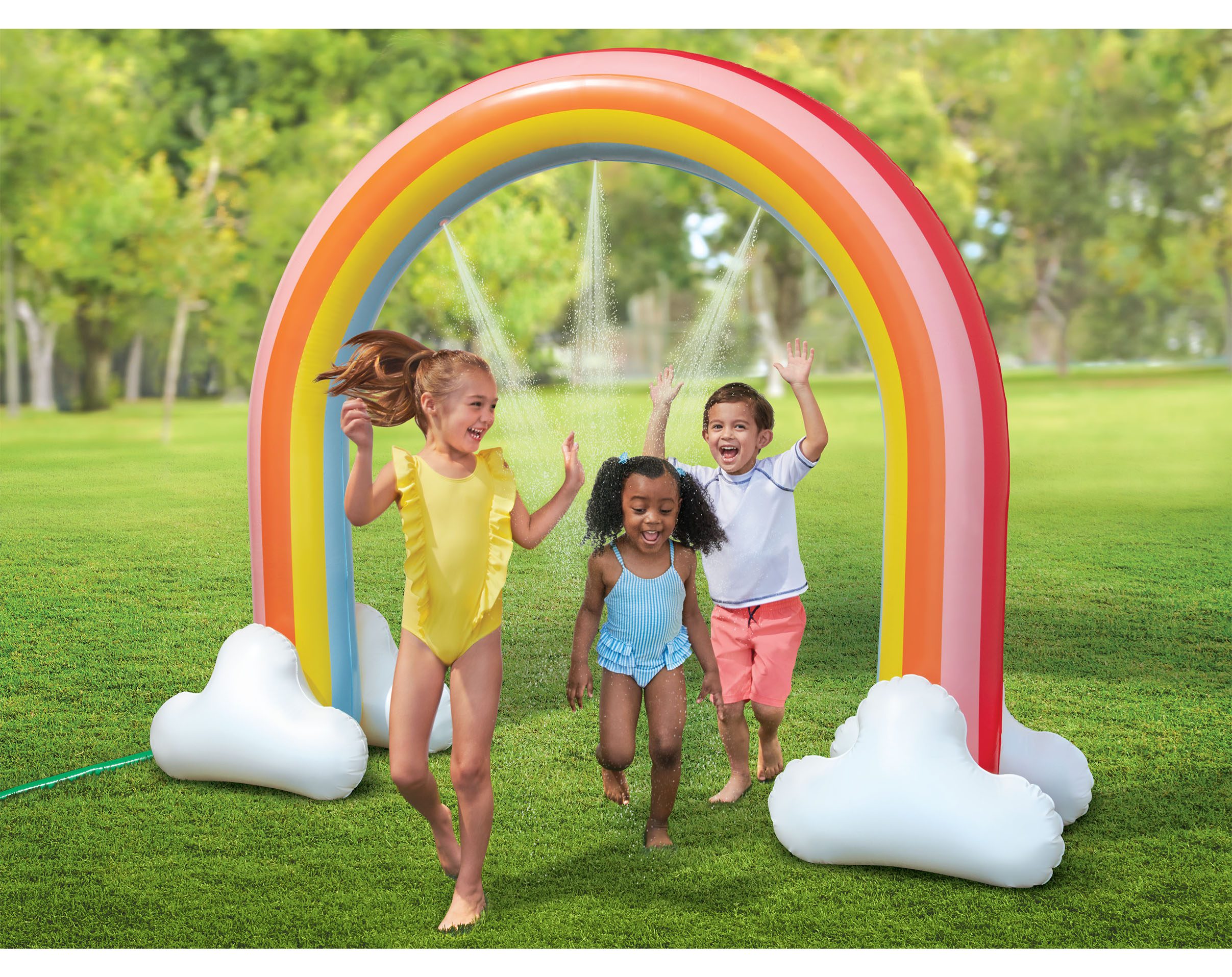
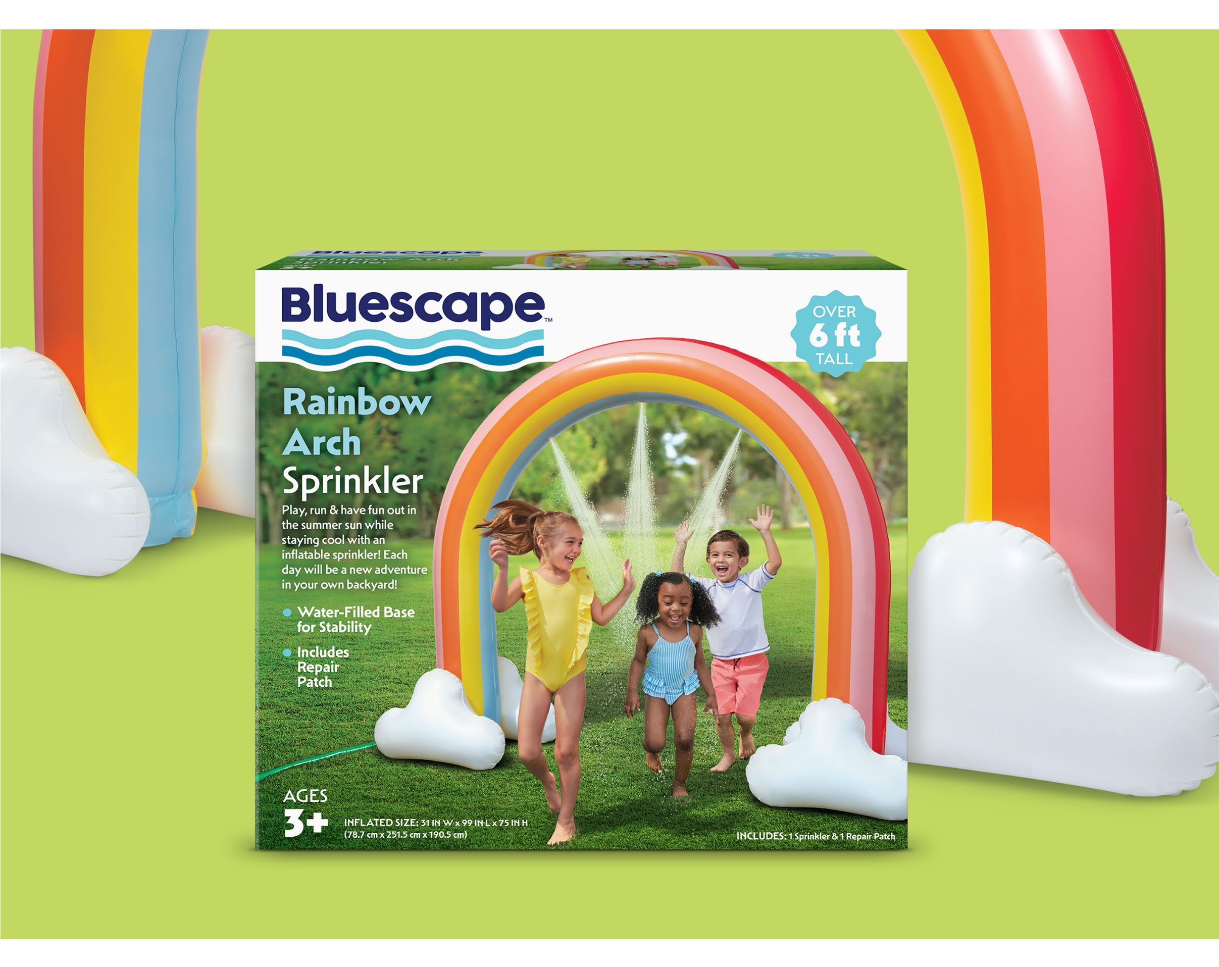
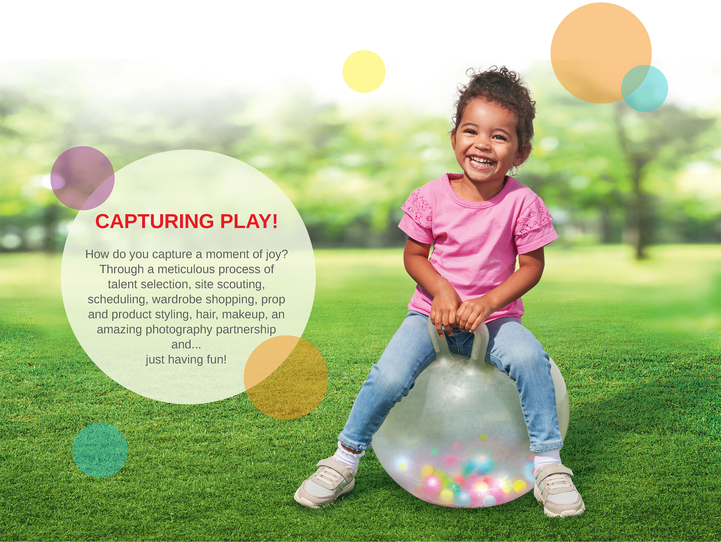
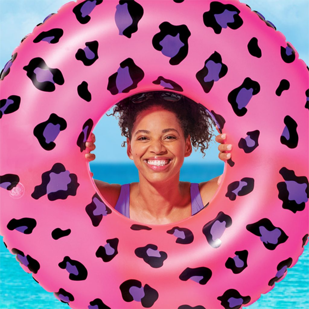
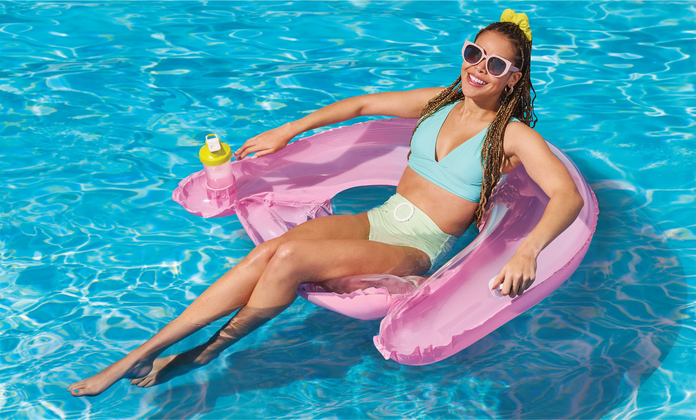
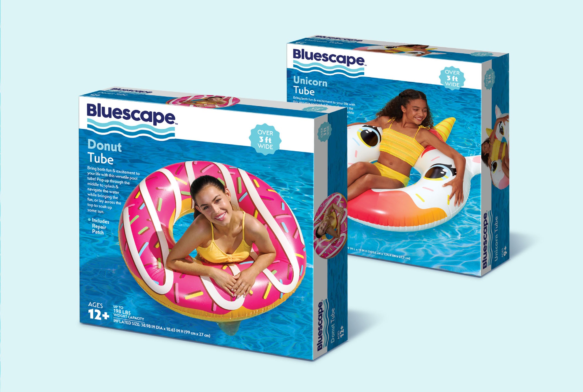
At McHale Design, we craft visual narratives that breathe life into your brand. Our lifestyle product photography is more than a mere snapshot—it’s a gateway to the soul of your product, inviting your audience to a world where every detail tells a part of your story.
We push creative boundaries with experienced art direction and photo enhancement, transforming mundane scenes into captivating visual stories. How can we tell your story?
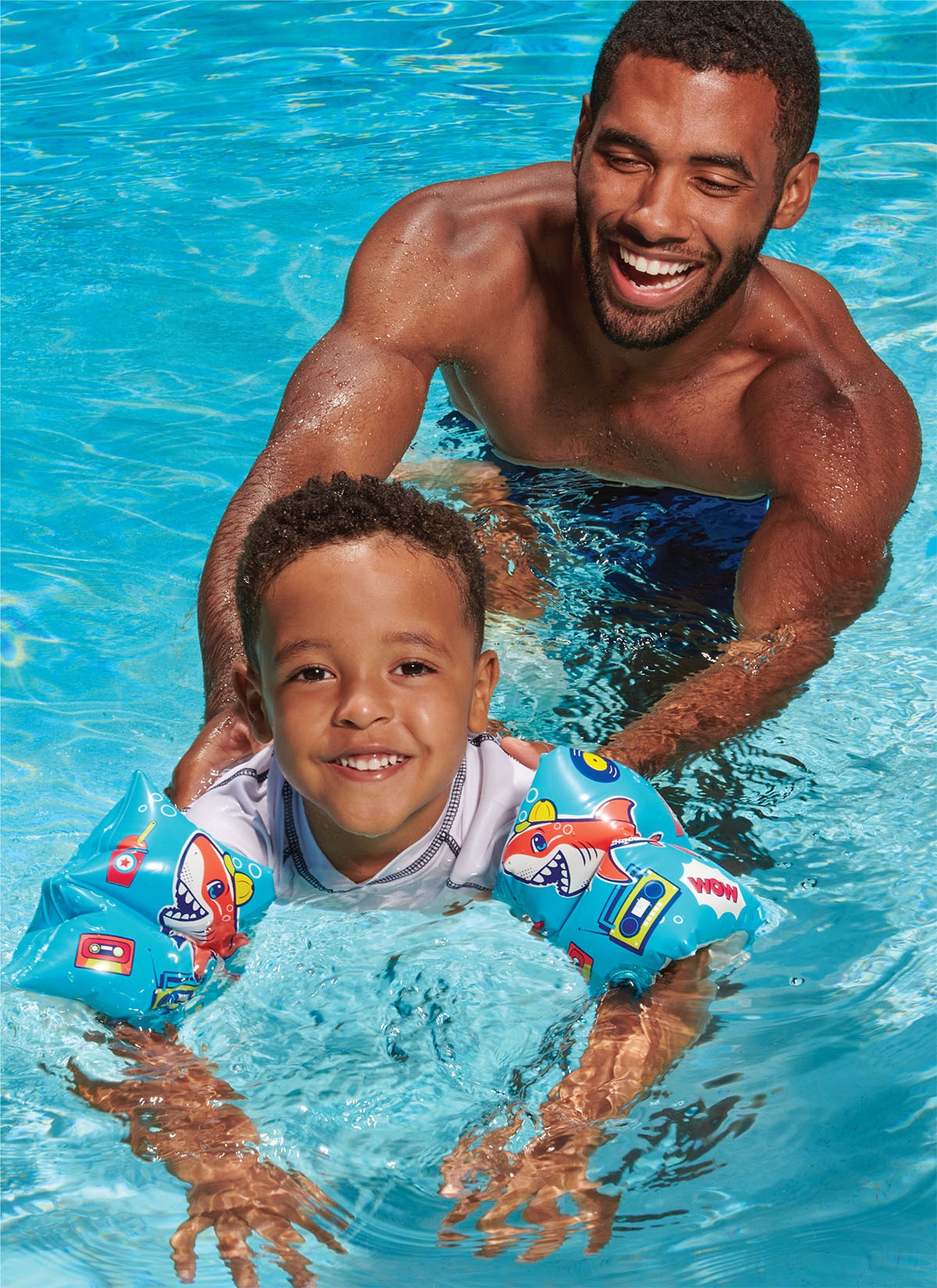

We’ve had the privilege of working with various ages and personalities. Experienced with challenging locations from park to pool, we extract authentic enthusiasm from the talent while spotlighting your product.
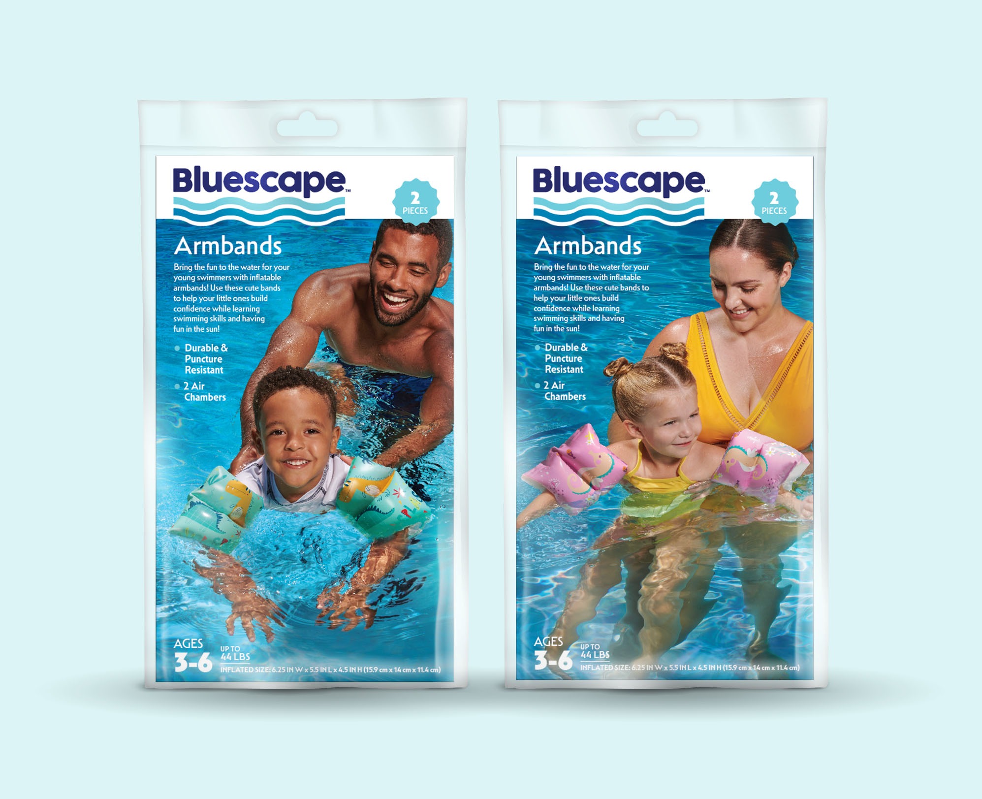
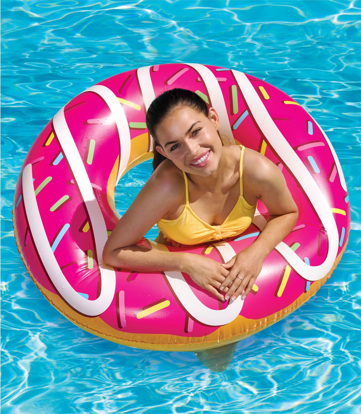

Behind every successful image lies meticulous planning and years of experience, whether child or furry friend; knowing how to capture innocent fun and connecting with the subject is what we do best.
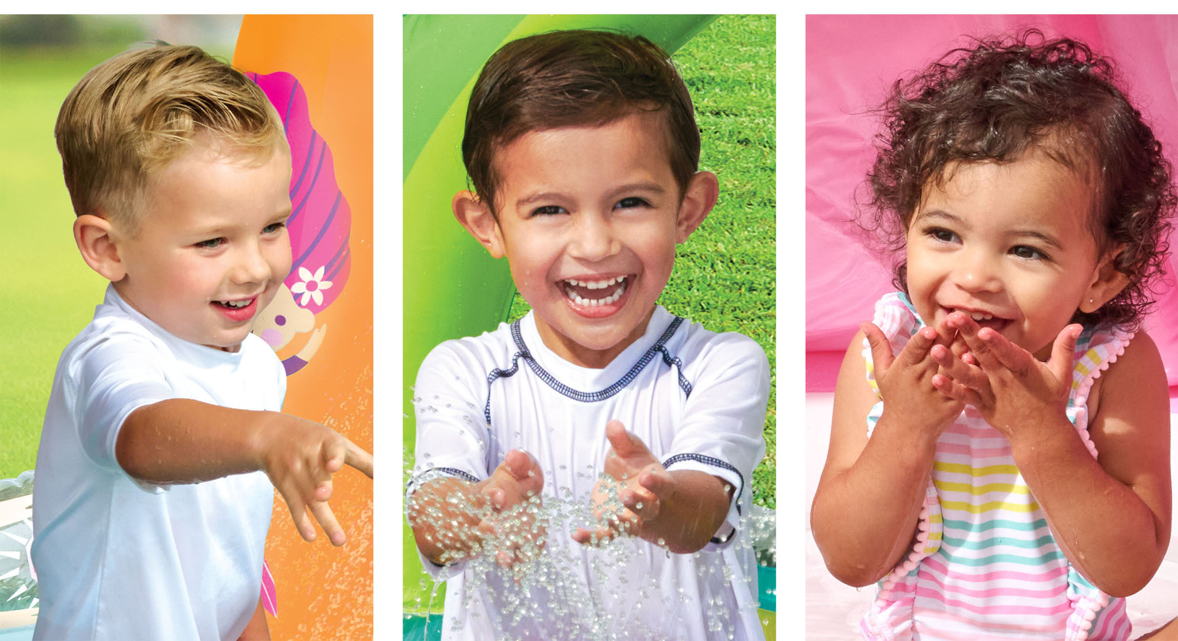
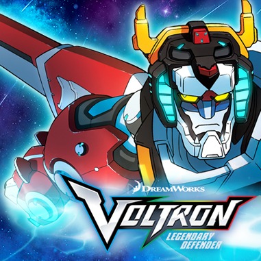
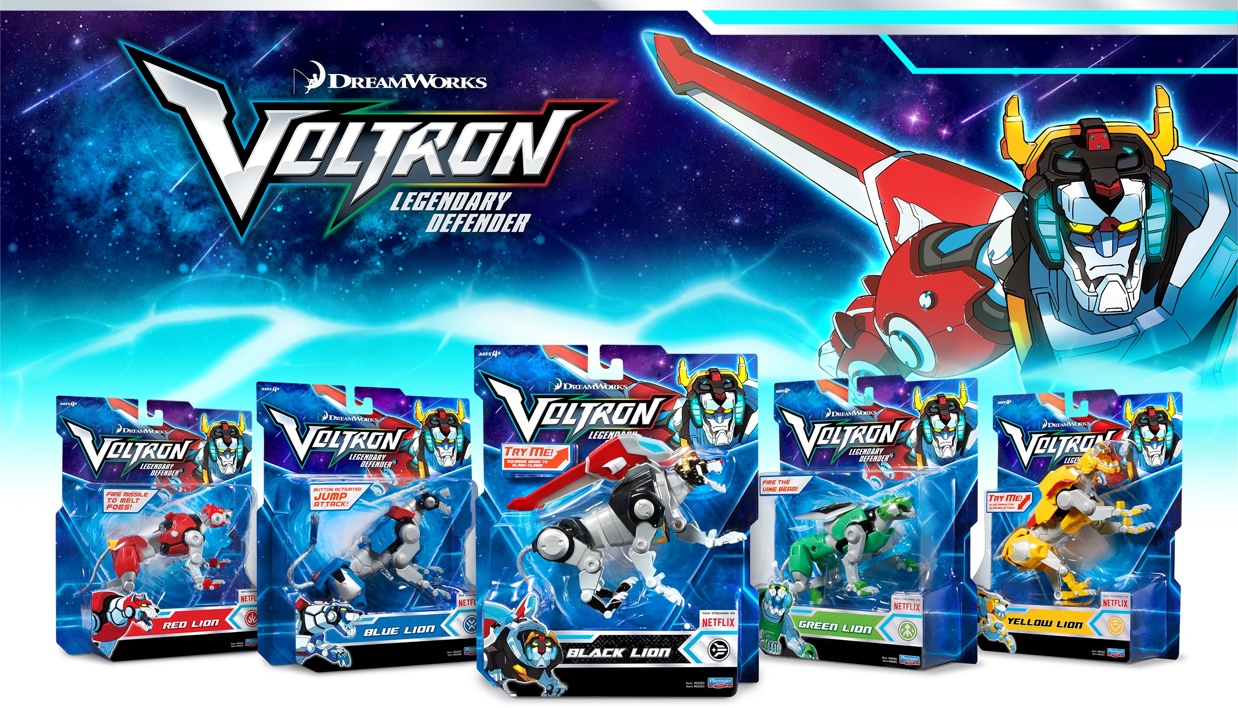

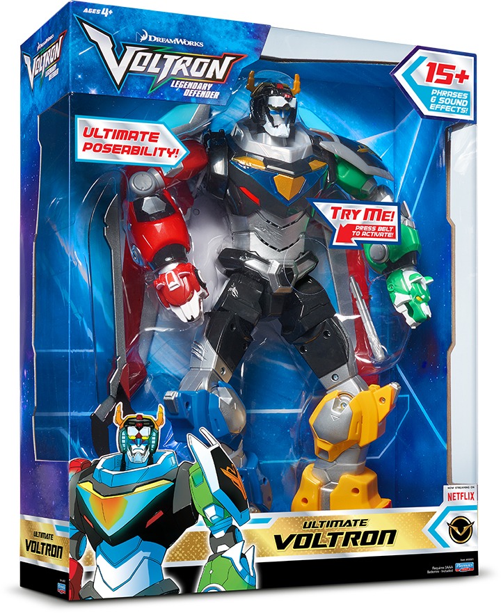
Making a Legendary Impression with Voltron Branding and Package Design
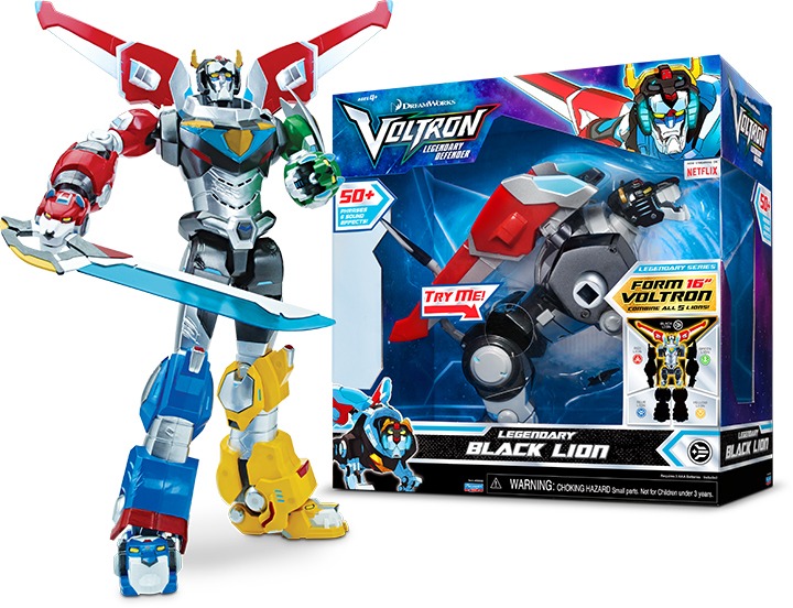
Even with 30+ years of history, the Voltron brand still packs some serious punch. When the DreamWorks update anticipated a full-scale barrage on the toy aisle, Playmates Toys entrusted the assignment to their go-to design team at McHale Design.
Having developed a rabid, loyal fanbase, the Voltron brand needed dual-appeal that would resonate not only with the child target consumer but also with the dedicated adult collector. Since McHale Design had successfully faced similar challenges developing the TMNT brand, experience helped propel the design process forward.
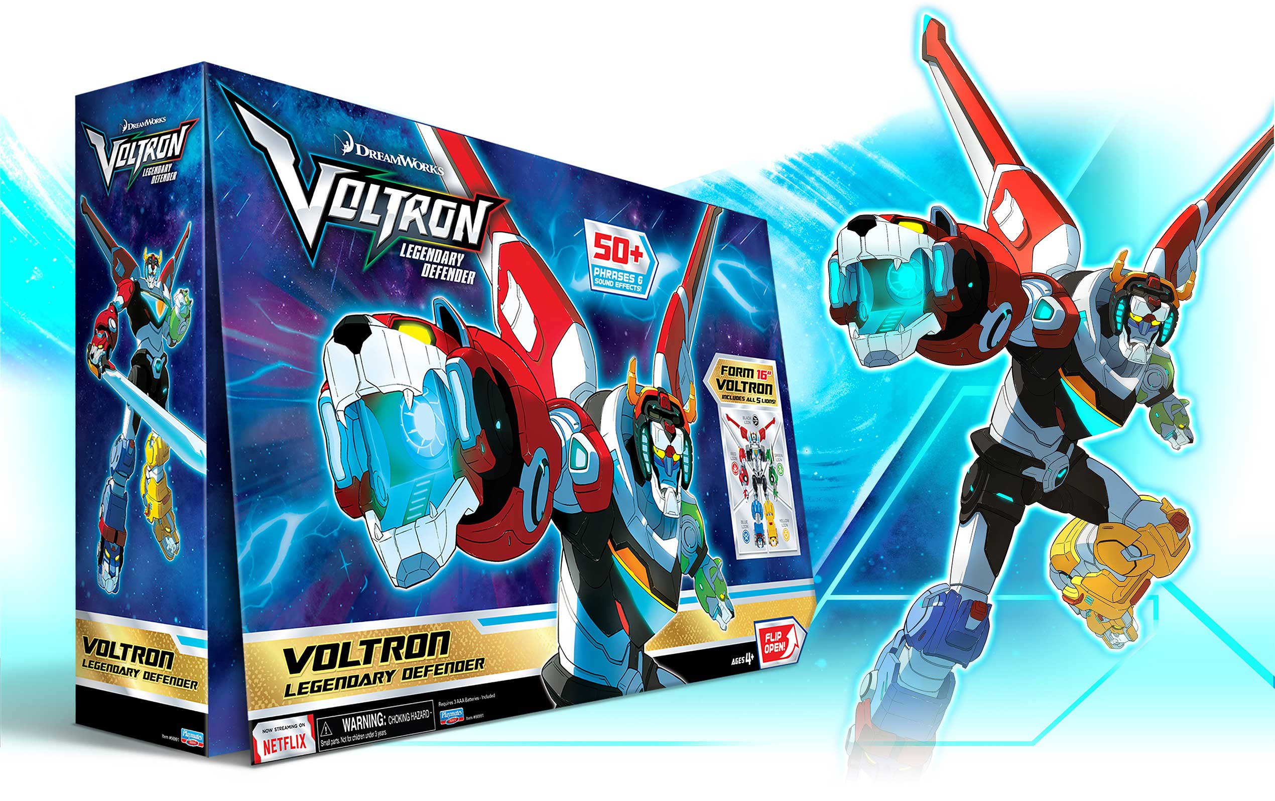
Combine for Action
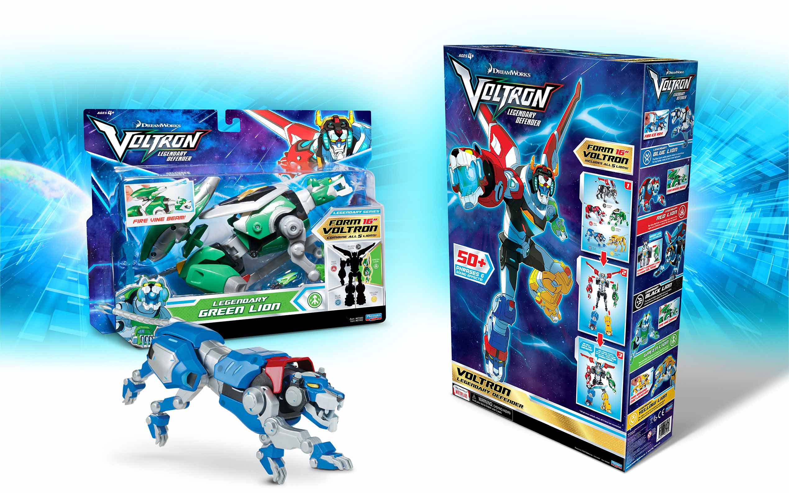
The team had to find a way to clearly communicate that some, but not all of the SKUs could be combined to create a large-scale, multi-piece Voltron, while maintaining a consistent brand identity across the entire line.
Our designers created a packaging template combining assets from the show with a proprietary, color-coded lion identification system highlighting the combinability of specific SKUs and clearly differentiating them from the rest of the line.
Armed with the success of the Netflix series, sales at Target, TRU, Walmart, and Amazon have continued to exceed expectations.
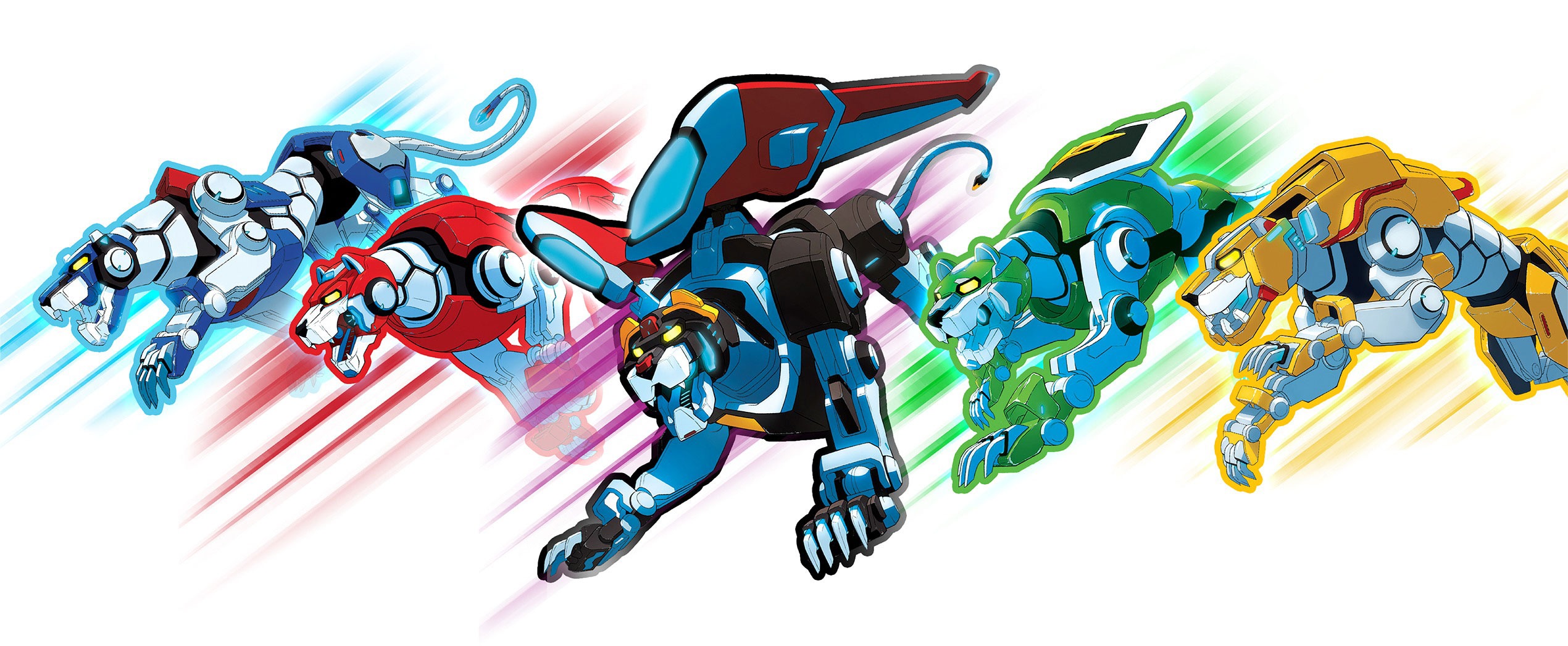
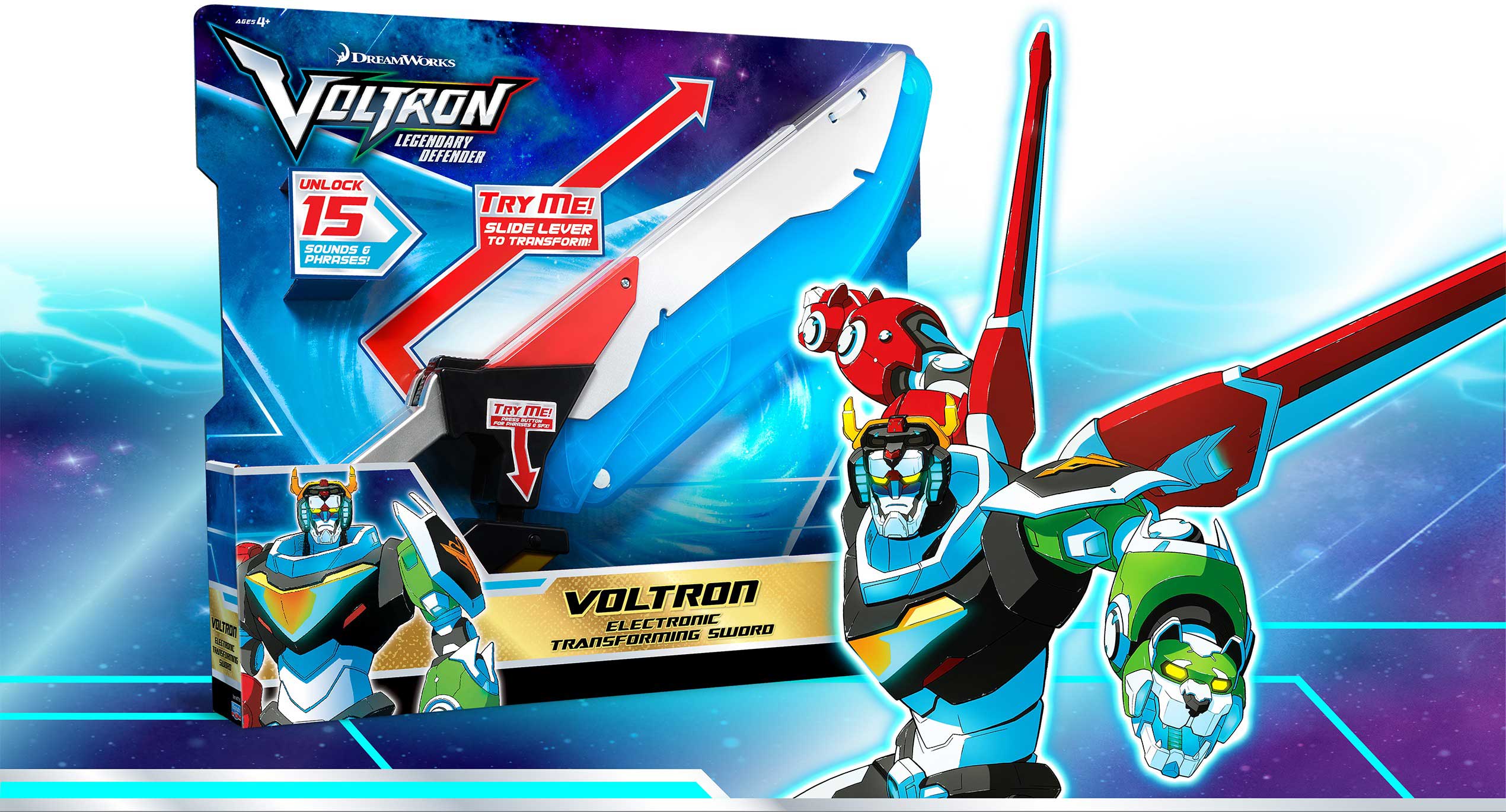


As leading brand experts, we pay special attention to your IP needs and craft a clear visual narrative that will resonate with your target market. Our original and playful designs result in graphics and animations that elevate your brand experience.


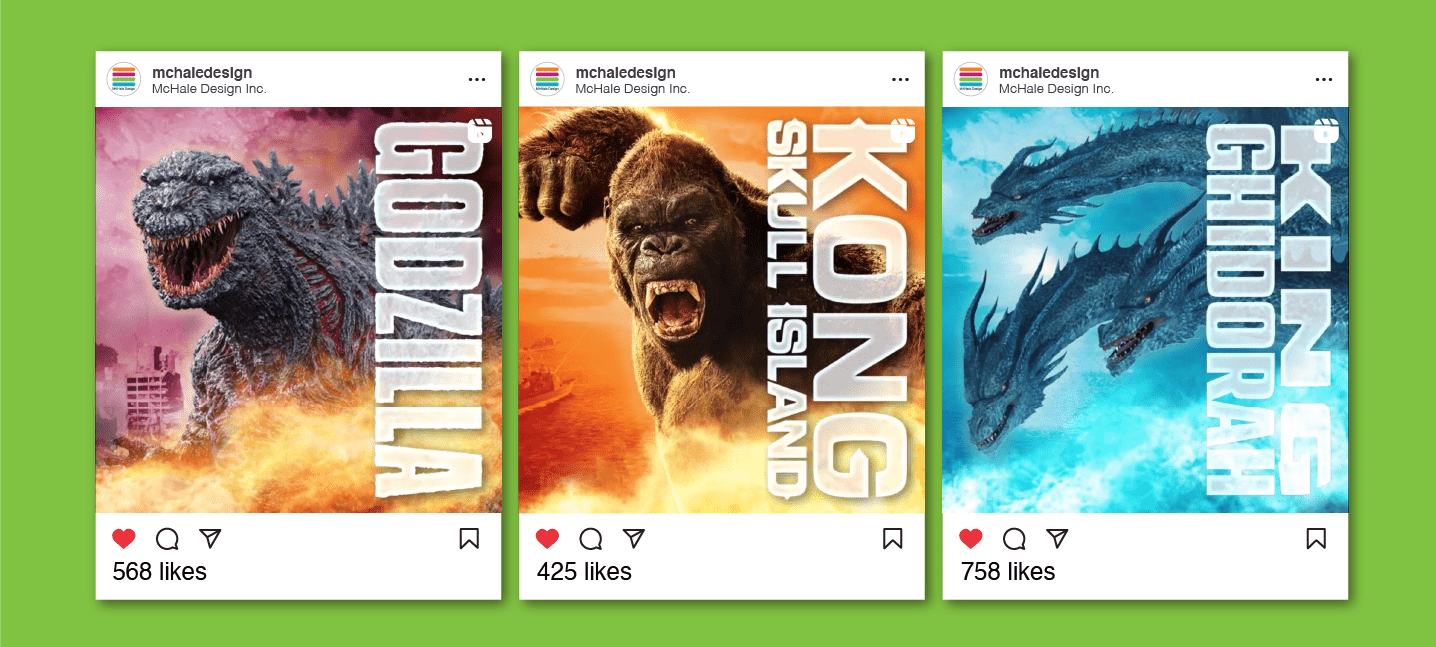
Social Media Style Guides Create Visual Impact
Our social media style guides amplify consumer engagement with content that is cohesive, integrated and dynamic. We create assets that focus on your core message while being true to your brand resulting in authentic, clickable content.
 Treasure Trekkers
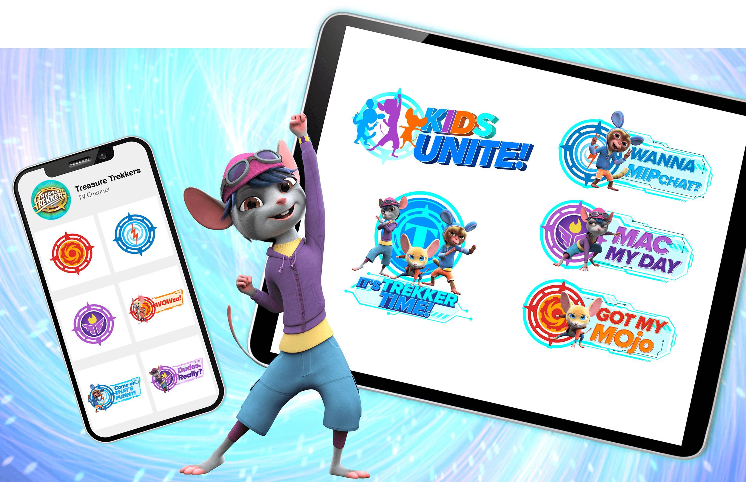
The producers of the animated series Treasure Trekkers needed style guide assets for their YouTube and social media initiatives. We created a wide range of icons and badges geared toward making large impacts on smaller screens and social feeds.
Social Media Style Guides Create Visual Impact Our social media style guides amplify consumer engagement with content that is cohesive, integrated and dynamic. We create assets that focus on your core message while being true to your brand, resulting in irresistible and authentic content.
The producers of the animated series Treasure Trekkers needed style guide assets for their YouTube and social media initiatives. We created a wide range of icons and badges geared toward making large impacts on smaller screens and social feeds.

Branding • Style Guide • Packaging
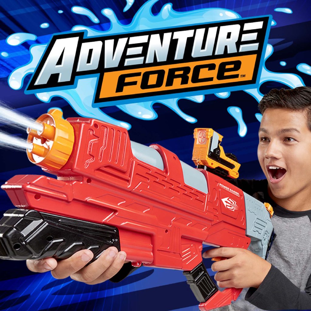
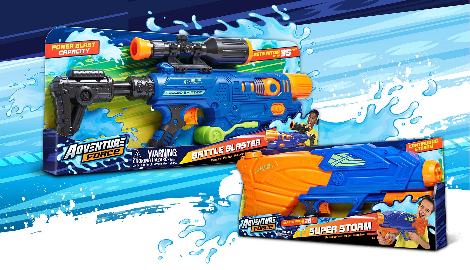
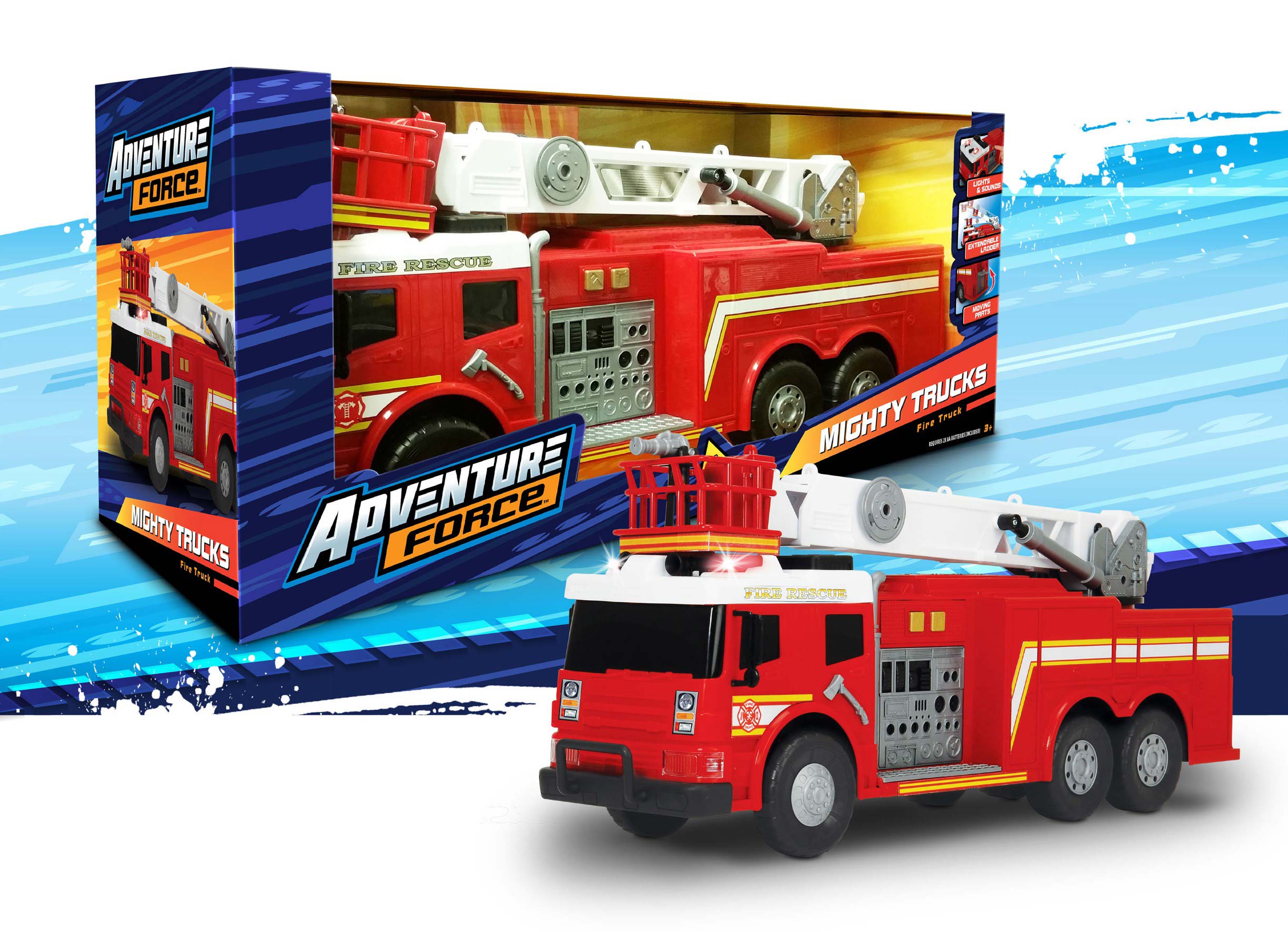
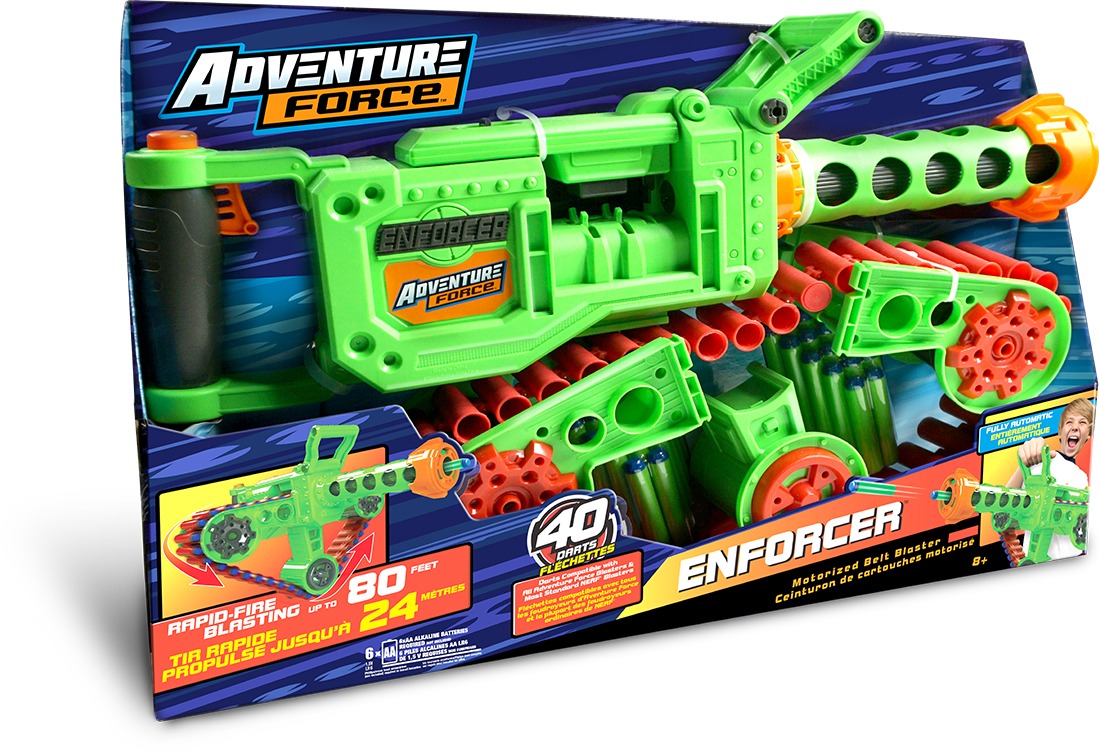
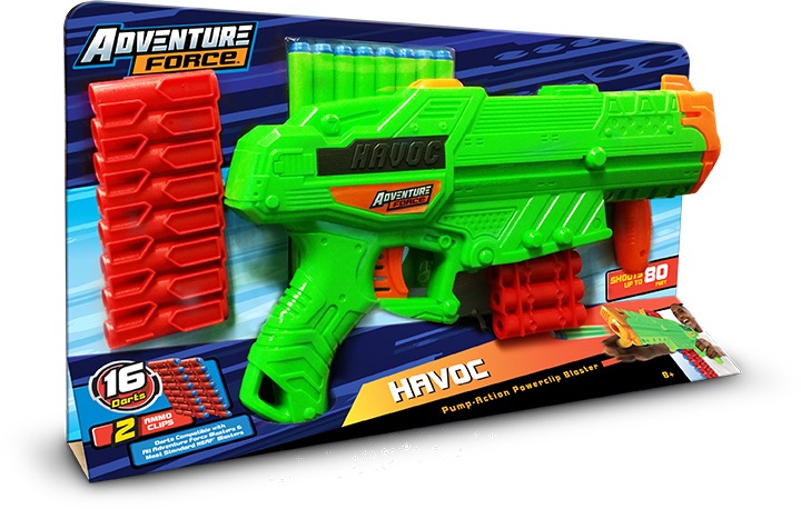
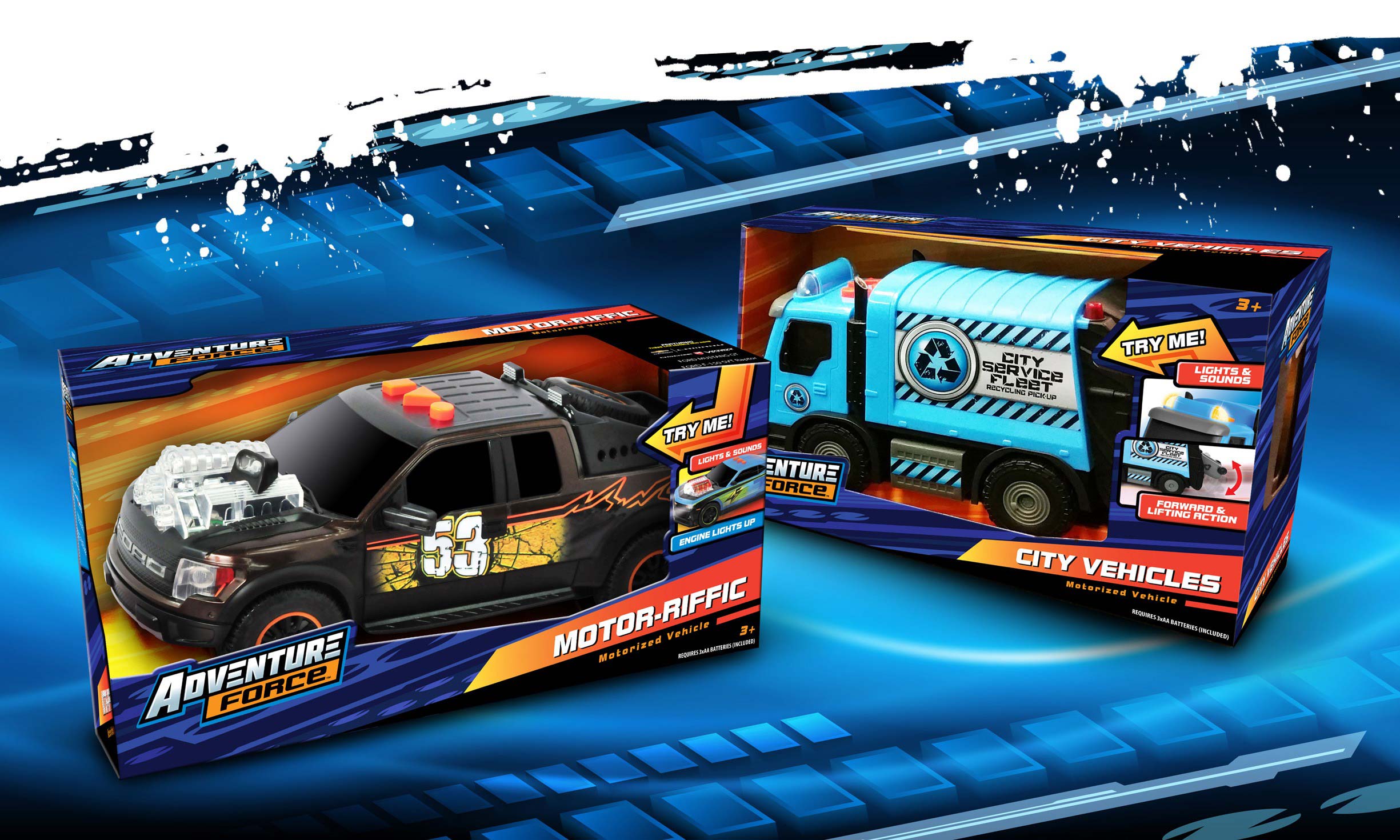
Adventure comes in many forms! Whether blasting with water or foam darts, racing to the rescue in a Fire Truck or to the finish line in a Formula One racecar, we’ve got you covered. Walmart looked to McHale Design to create an overarching identity for their private label boys toy brand. A Style Guide with versatile logo, dynamic patterns, and an easily adaptable modular trade dress system allowed for diverse packaging applications. The brand redesign resulted in a powerful and unified shelf presence in the toy aisle.
Aiming for Clarity
We created a clear branding hierarchy showcasing the action-oriented fun. Coordinated pattern colors represented different segments and helped pop the product from the packaging. Simplifying the multitude of feature callouts and utilizing angles to exaggerate movement, the focus was all on the toy.
What’s the Buzz?
Step back in time to a simpler country life, where the air is clear, the land is bountiful, and cute little animals wear clothes and don’t eat each other!
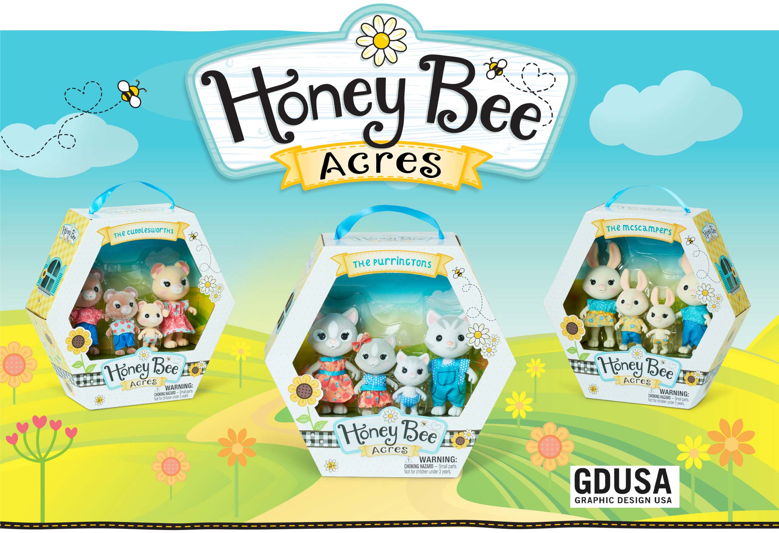
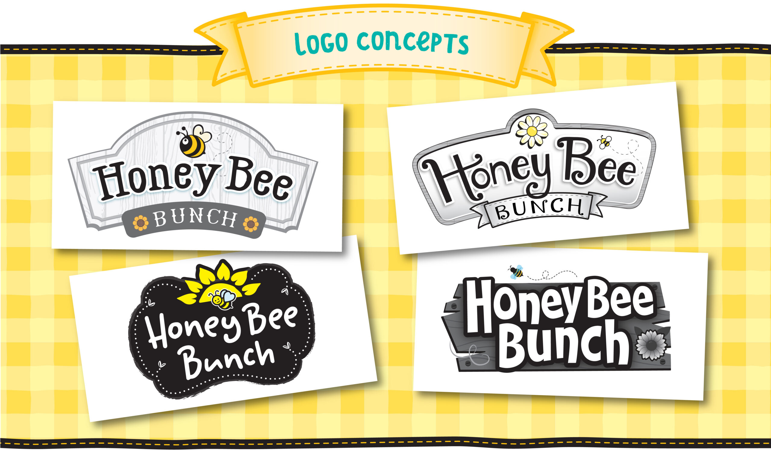
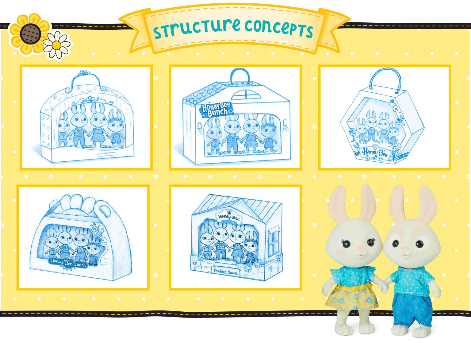
Logo, branding, structure design–we did it all and enjoyed every minute of our honeyed escape. If only real life could be so sweet!
We are honored to announce that our Honey Bee Acres designs have won a 2022 GD USA Package Design Award! The critters of Honey Bee Acres are so excited that they have given us an honorary County Fair Prize, even though we missed out in the “Best Apple Pie” category. Next year!
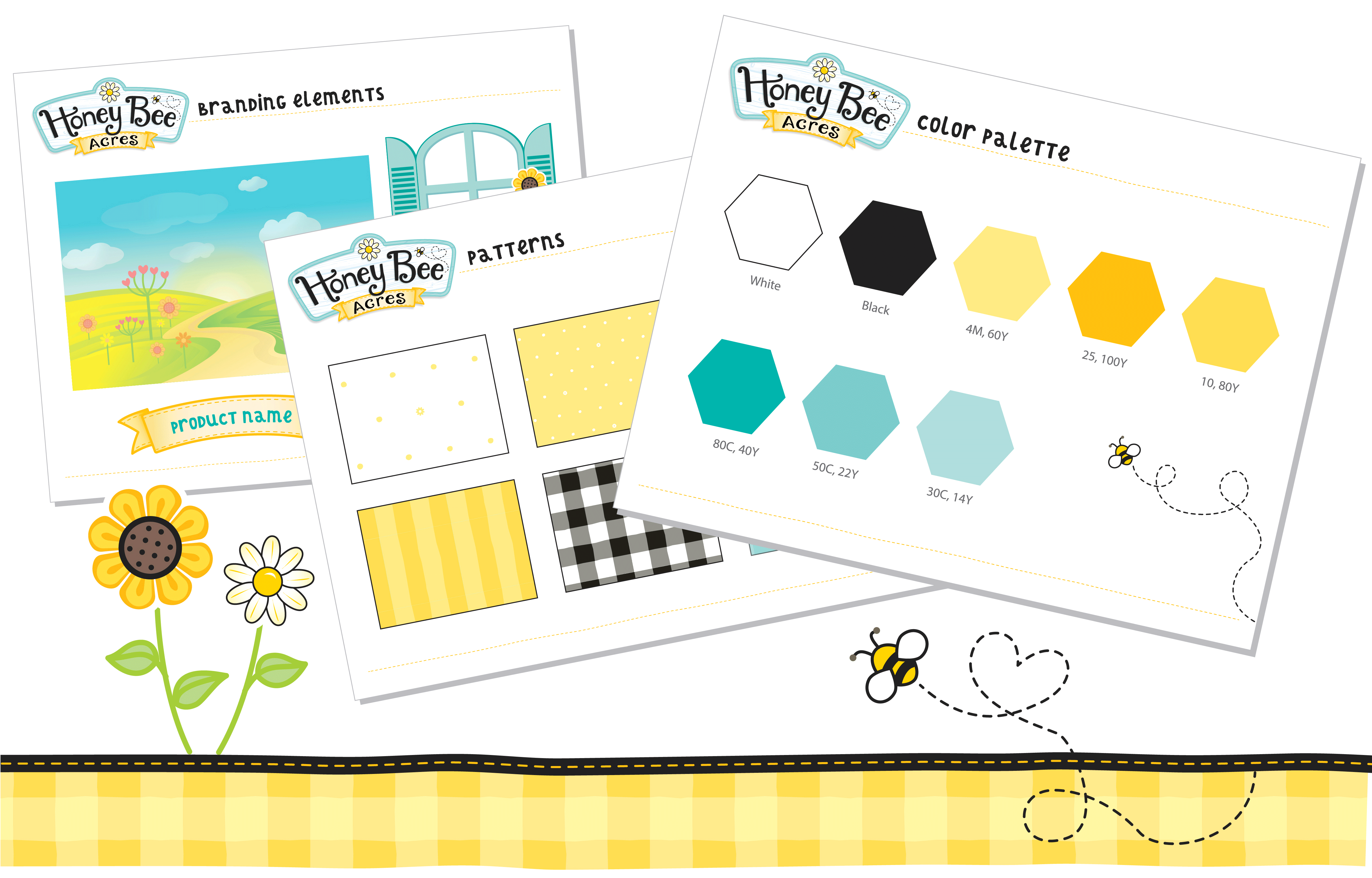
Patterns, colors, typefaces… the Honey Bee Acres Style Guide includes all the elements and guidelines needed for cohesive shelf presence. Country themed patterns and graphics provide the brand extra visual support to thrive and grow across multiple platforms.

Baby Steps to Big-Time Sales!
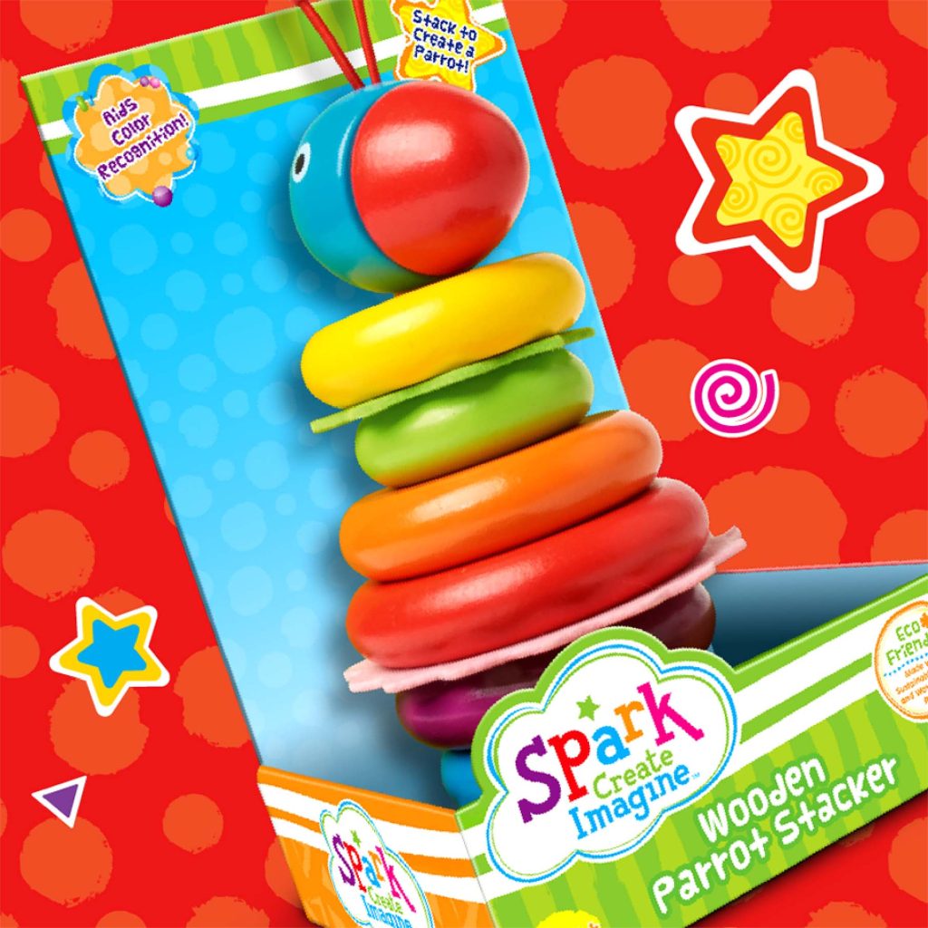
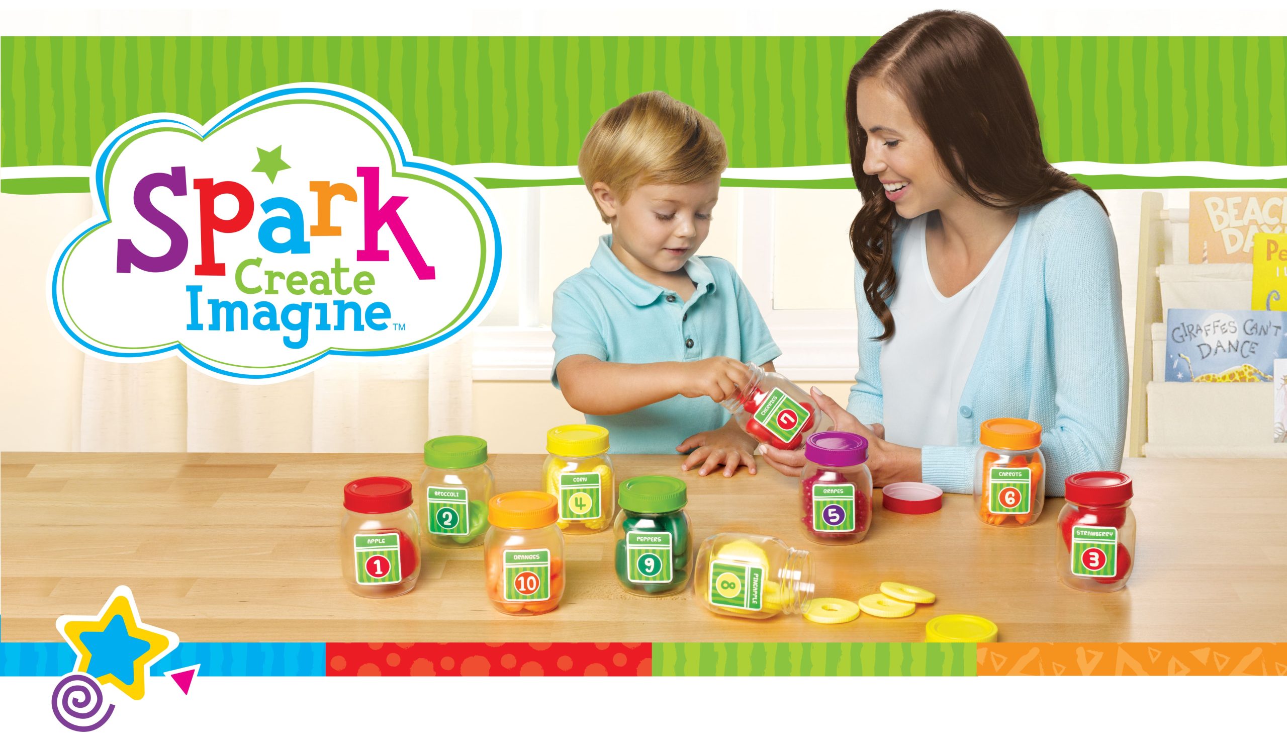
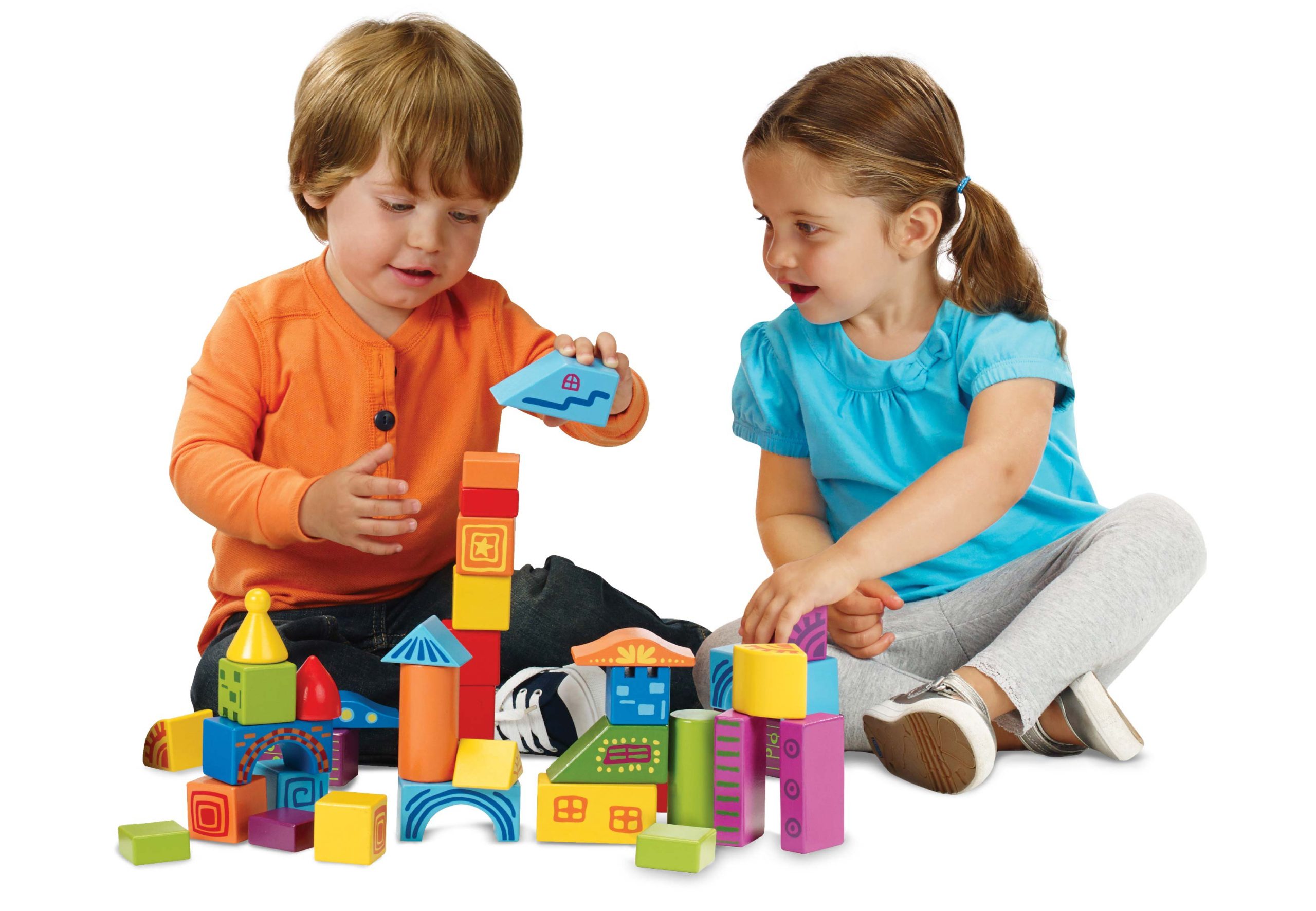
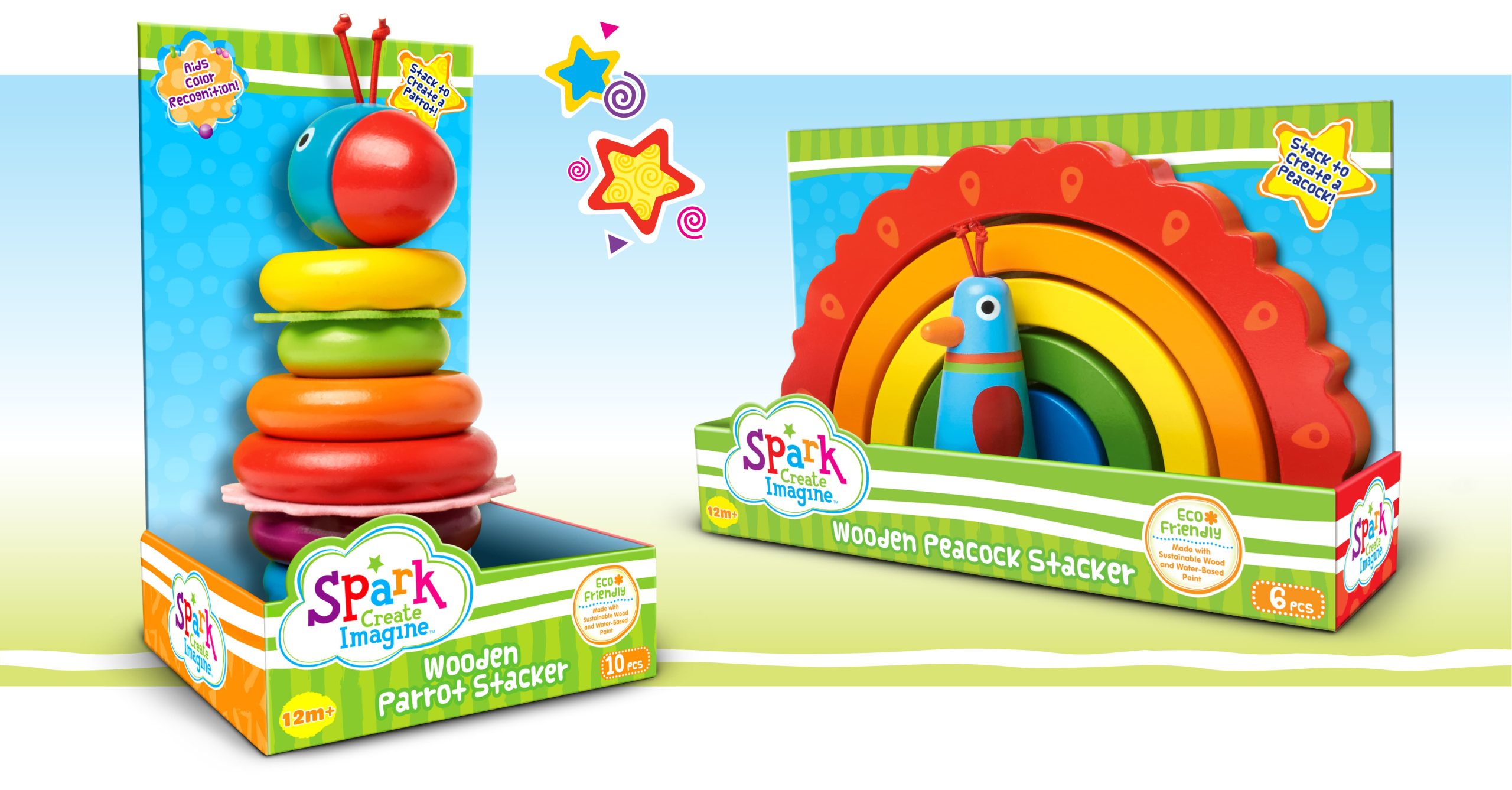
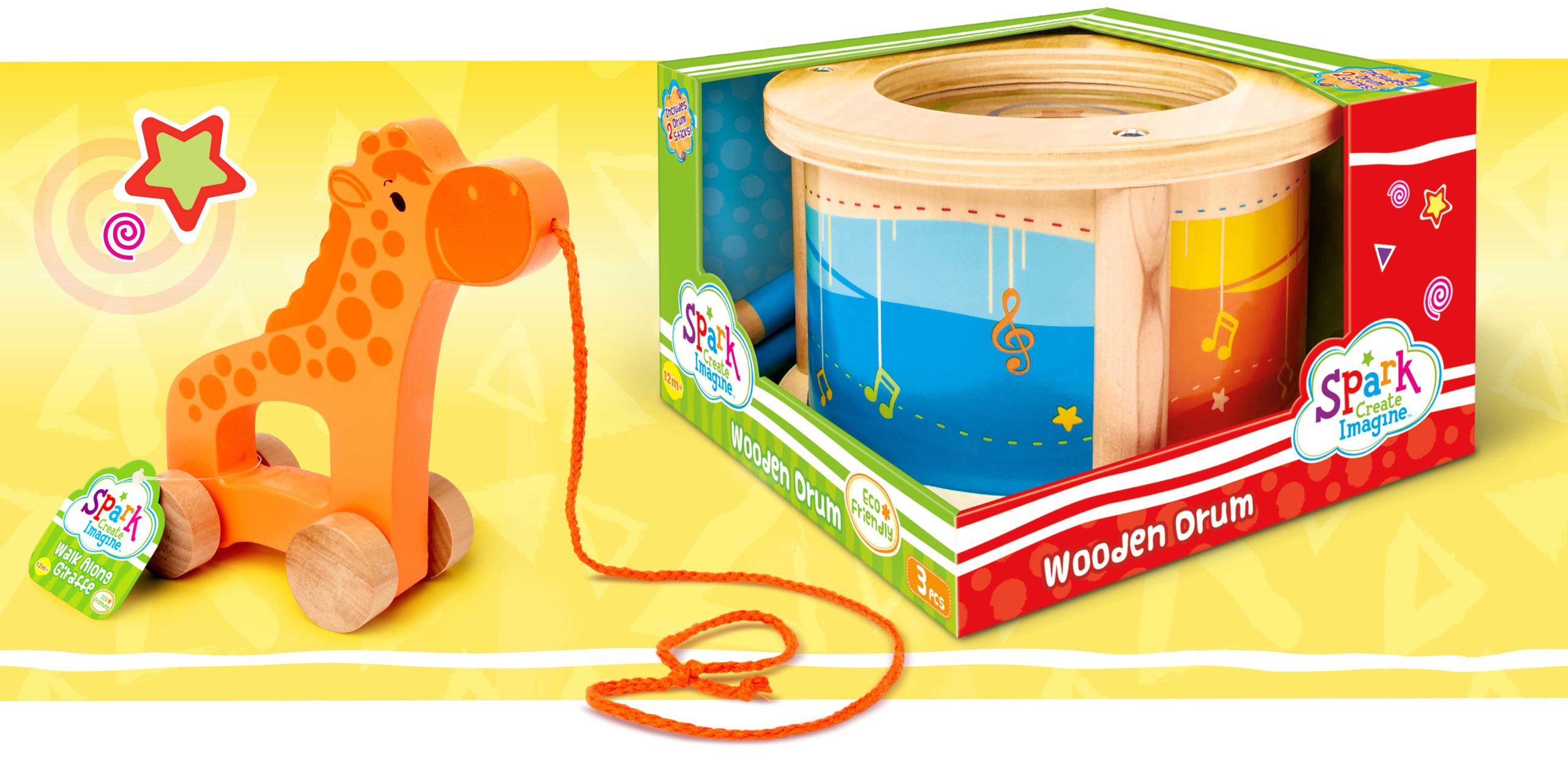
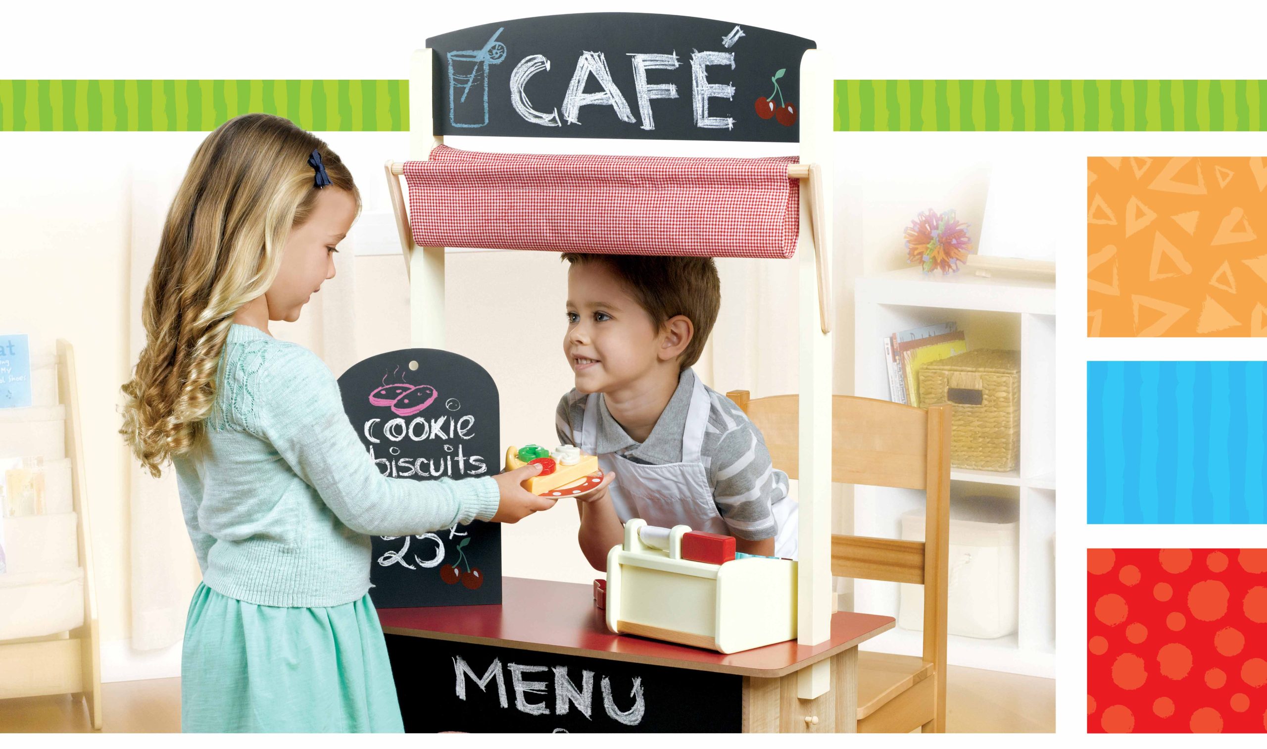
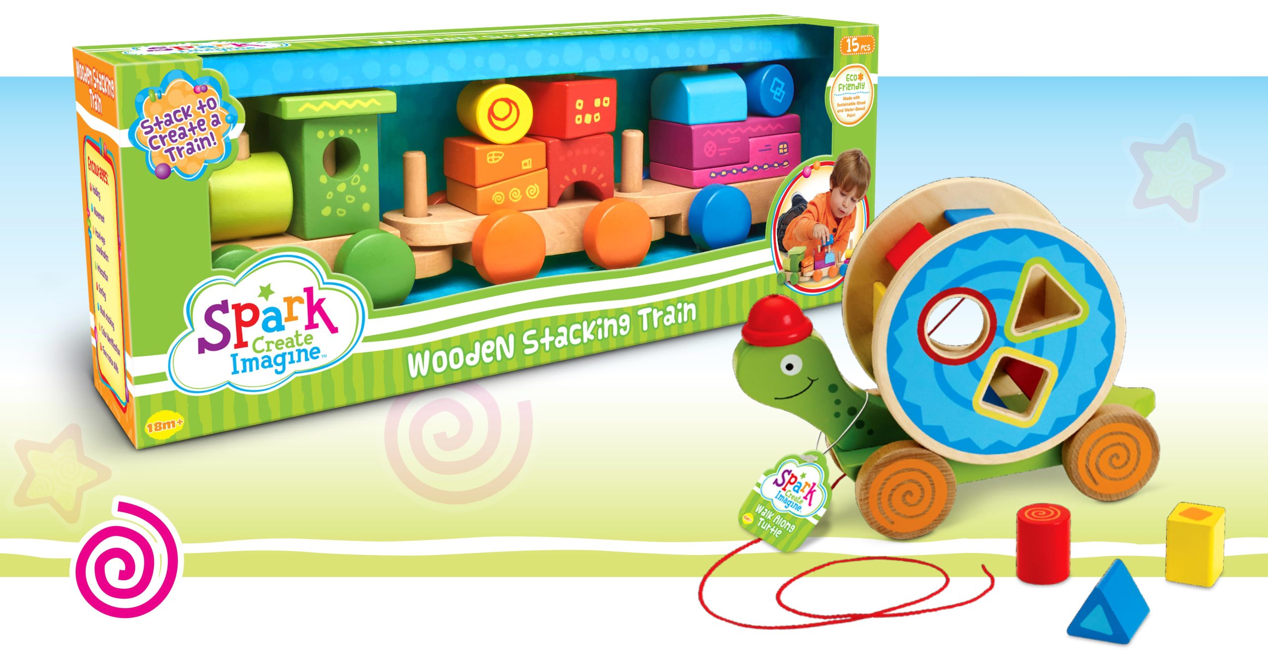
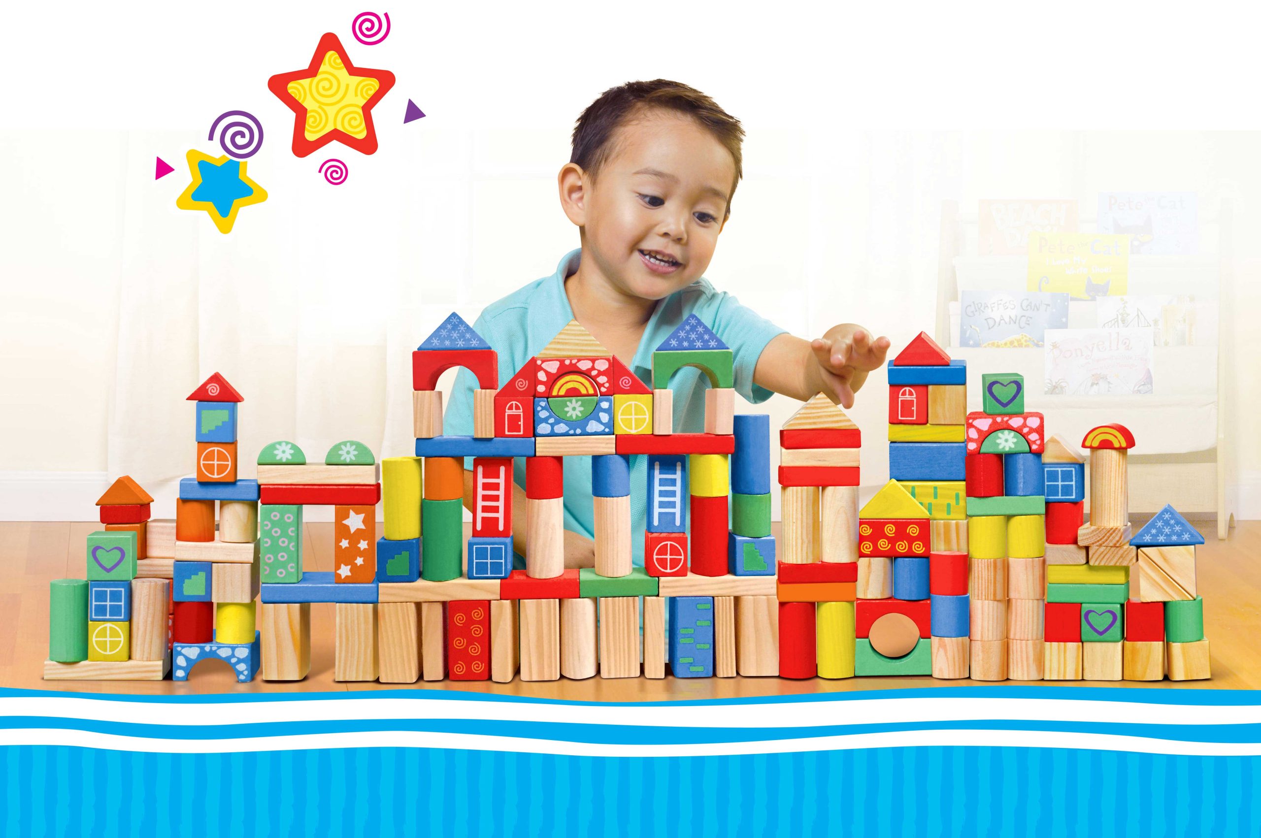
Mega-retailer Walmart designated McHale Design as their creative branding and package design agency of choice for S.C.I, the private label line of eco-friendly preschool toys. Showcasing the premiere quality of the product and its developmental features, McHale developed a style guide filled with a sweet visual esthetic that included the logo, color palette, patterns and packaging.

Drawing New Inspiration
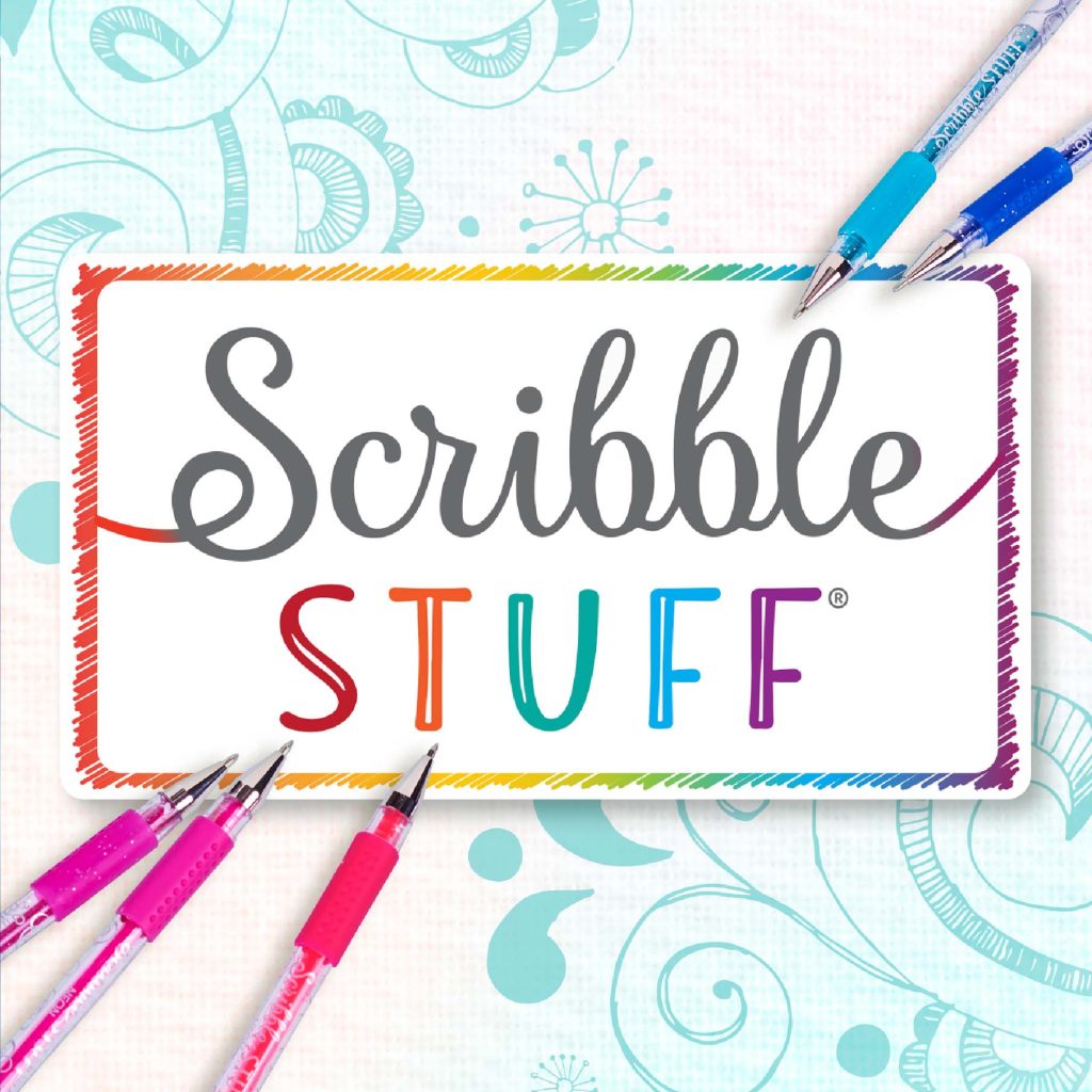
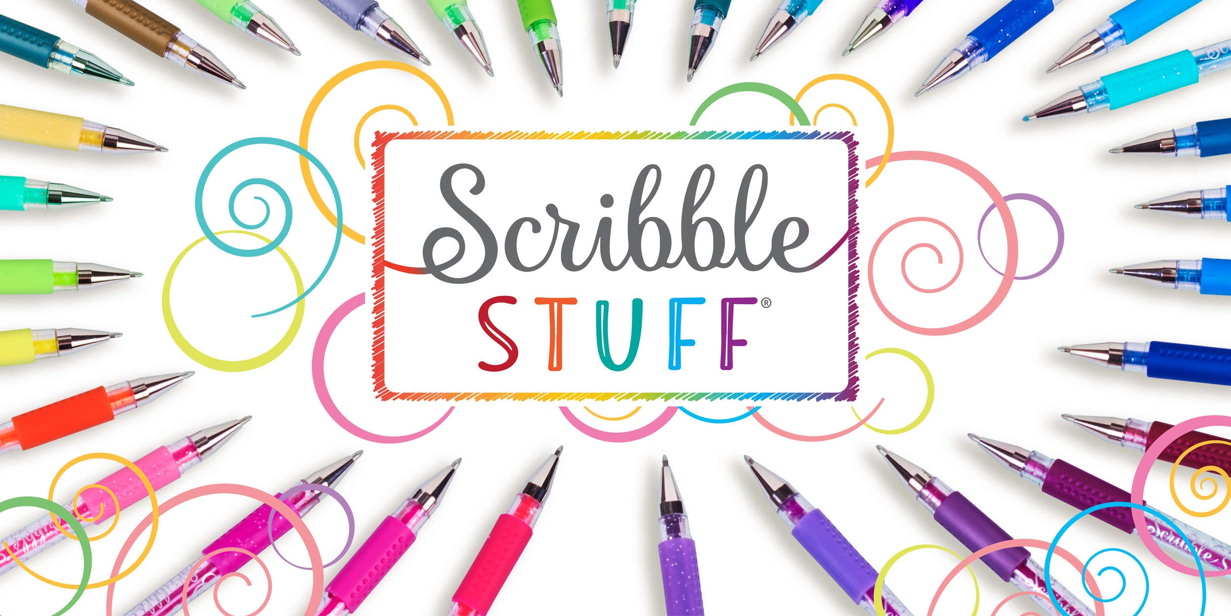
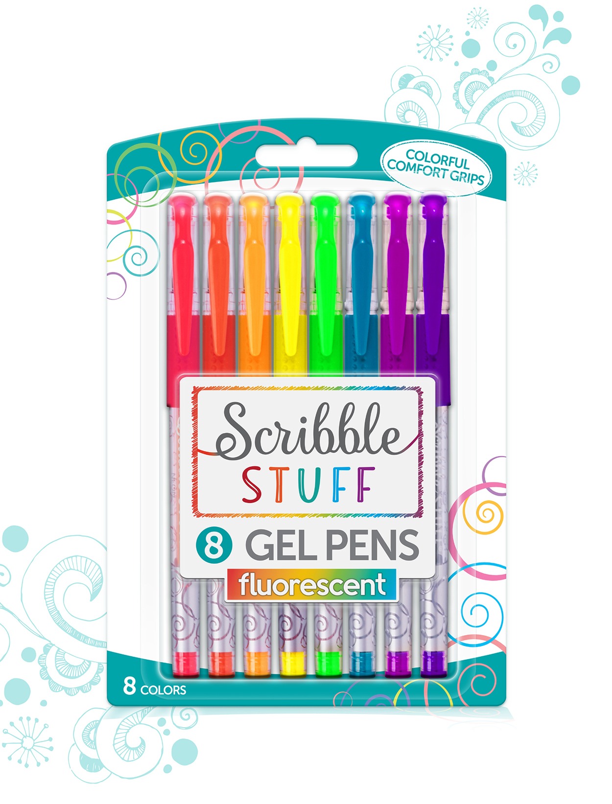
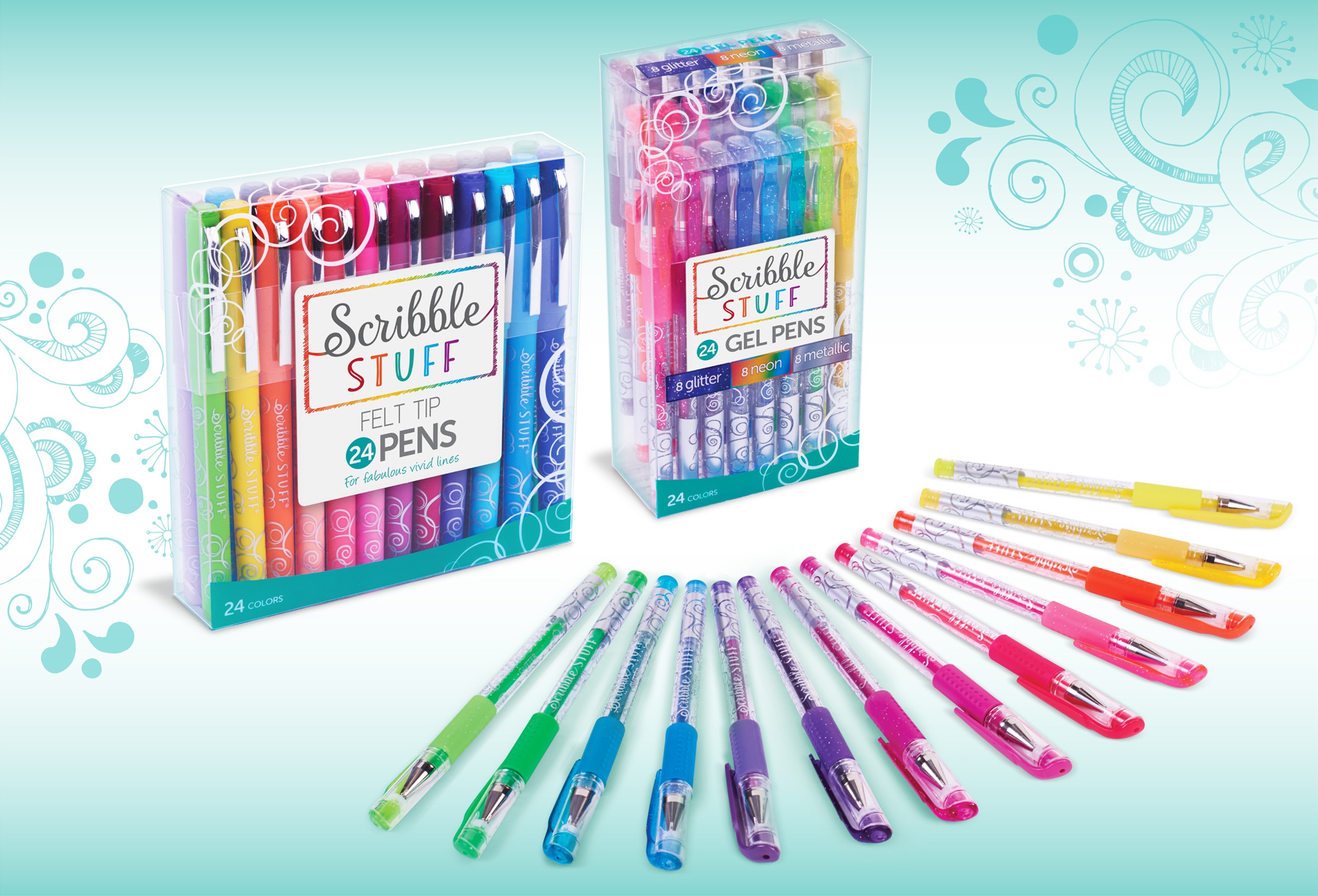
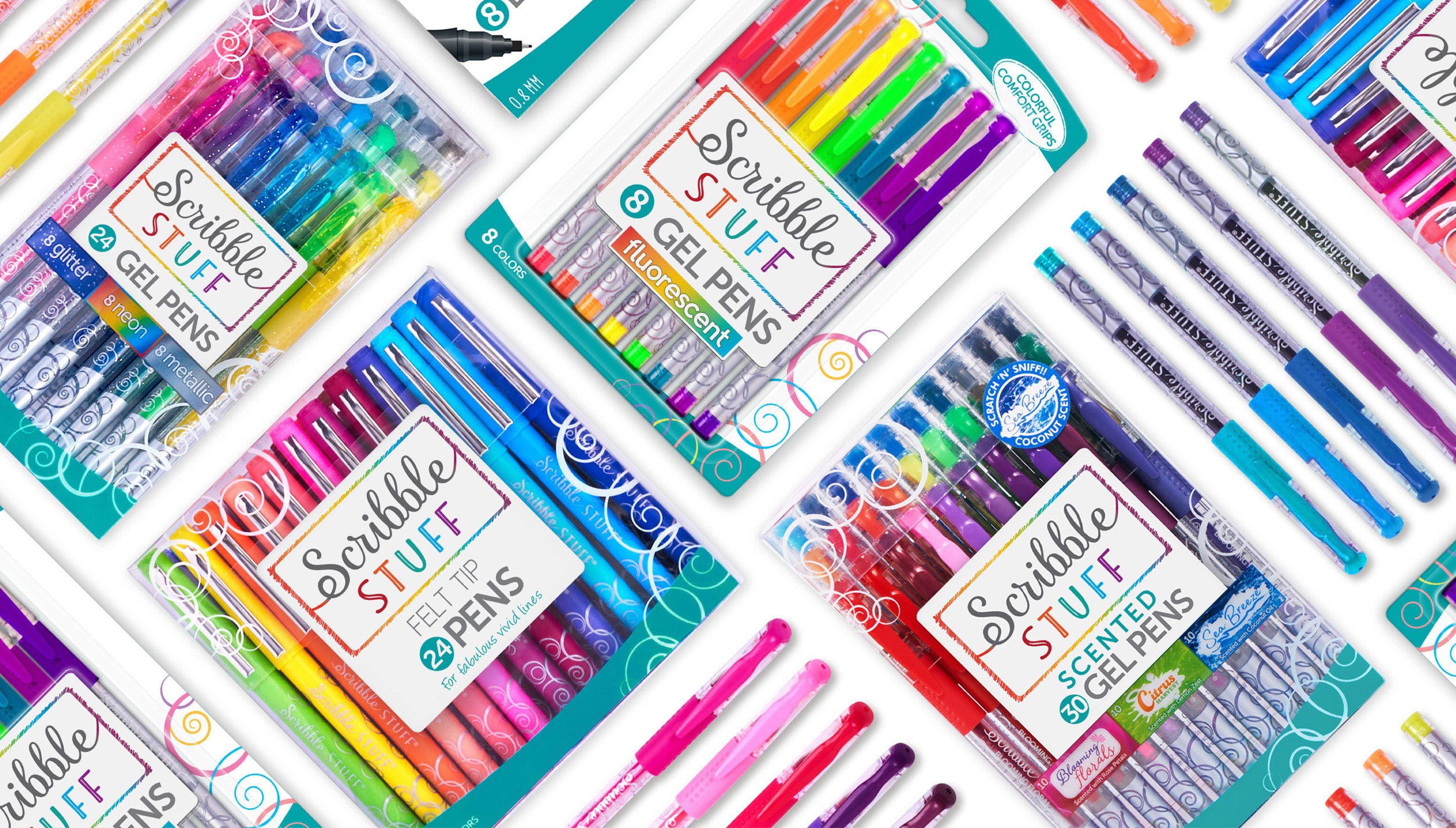
Mattel-Mega Brands’ Scribble Stuff line was due for a colorful new identity so they reached out to the specialists at McHale Design to overhaul the brand with a fresh new logo, dynamic branding and package design that would position Scribble Stuff as the preferred pen of the sophisticated Fashionista!
During the design process we were mindful of the colorful impact we wanted to achieve on shelf, so it was important to allow the vibrant colors of the pen barrels and caps to come through. Intentionally placed scribbles and swirl motifs provided just the right stuff.
WHAT OUR CLIENTS ARE SAYING
QUALITY WORK
We have worked with the McHale team for 20+ years. They are passionate, creative, detailed and deliver quality work.
PLAYMATES TOYS
M. ADAMSEN
FANTASTIC EXPERIENCE
McHale is at the top of my list. I would recommend their services for the level of professionalism they deliver and the quality of the product they create.
WALMART
J. BAXLEY
CREATIVE INSIGHT
We were able to stand out from our competition thanks to their creative insight and ingenuity.
MATTEL
C. FLECKER
EXCELLENT RESULTS
The McHale team always delivers the best in creative packaging solutions on target for our consumers. They create innovative work, accomplished on time with excellent results.
MOOSE TOYS
D. CANON
ATTENTION TO DETAIL
Their attention to detail, creative expertise and project management have been first class. Far Out Toys could not wish for a better creative partner and we continue to count on Joe and the team to help fuel our growth.
FAR OUT TOYS
S. WALDRON
AN ABSOLUTE DELIGHT
We have been working with McHale Design for over 4 years now and everyone on their team is an absolute delight as well as some of the smartest, and most talented people we have ever worked with.
THE BUREAU OF SMALL PROJECTS
D. GAZ
THE MCHALE METHOD

1. Discover the Challenge
Determine and clarify your brand goals

2. Define the Solution
Deepdive to map out your pathway to success

3. Develop the Creative
Design assets that exceed your project objectives

4. Deliver
the Solution
Deliverables sent and implemented

